Modern Spanish Glam: Using Graphic Tile Tastefully
Photography Courtesy of Dandelion Dreams Photography
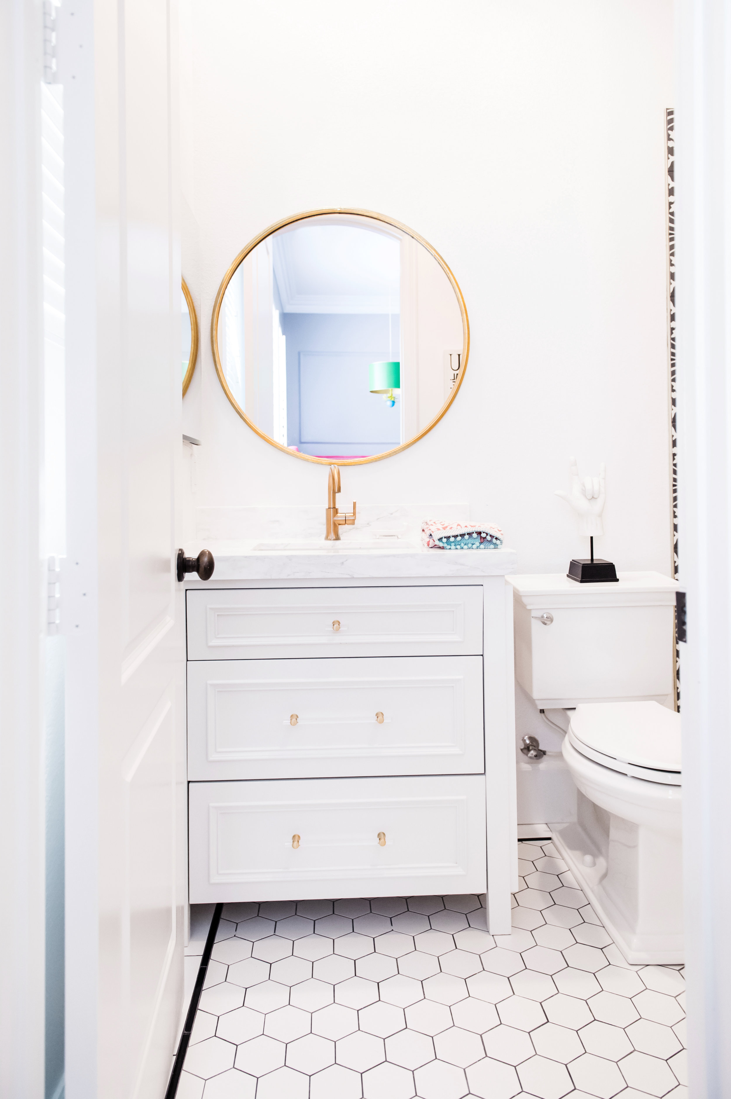
SPANISH GLAM TEEN BATHROOM REMODEL
The Project:
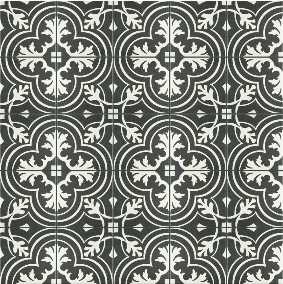
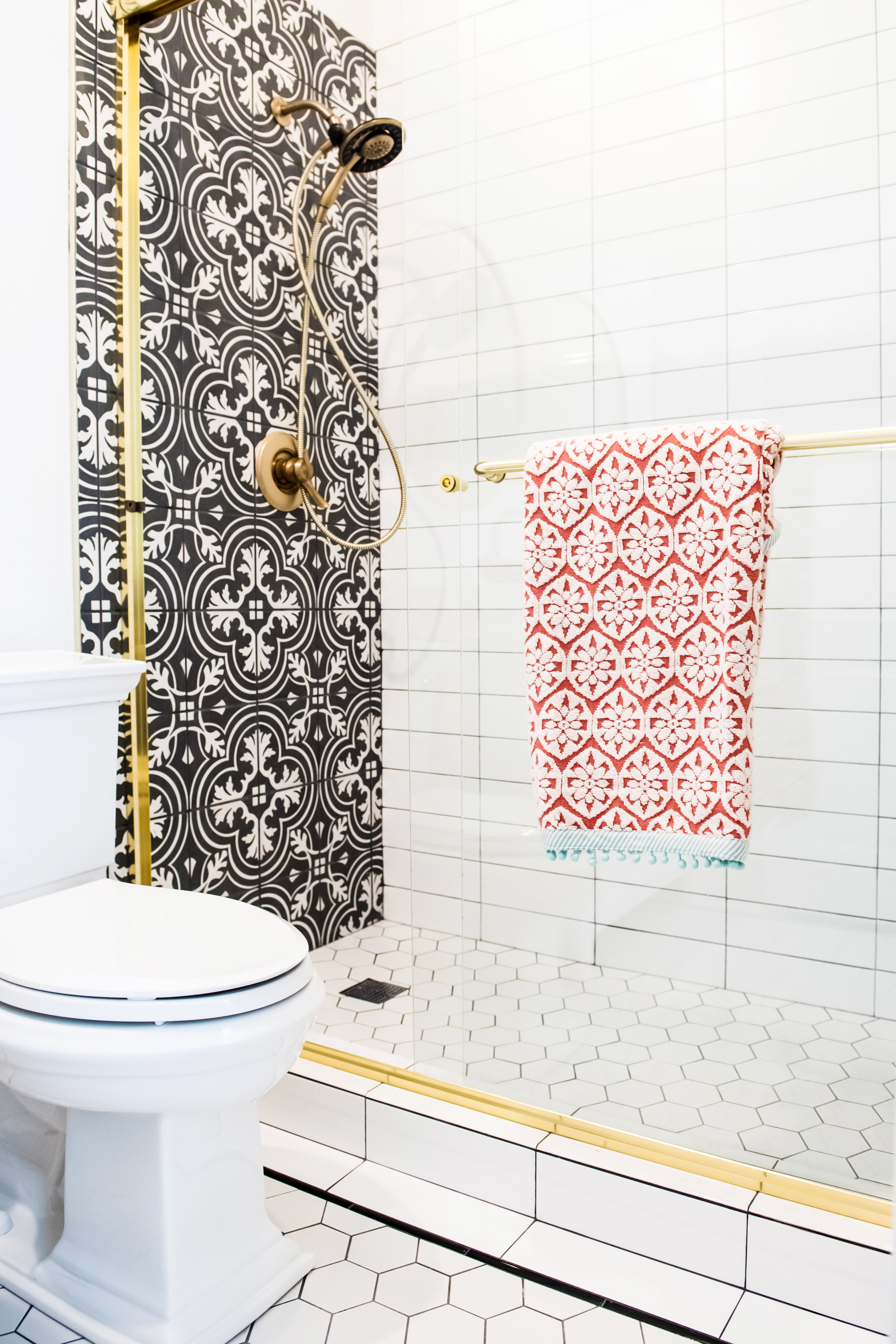
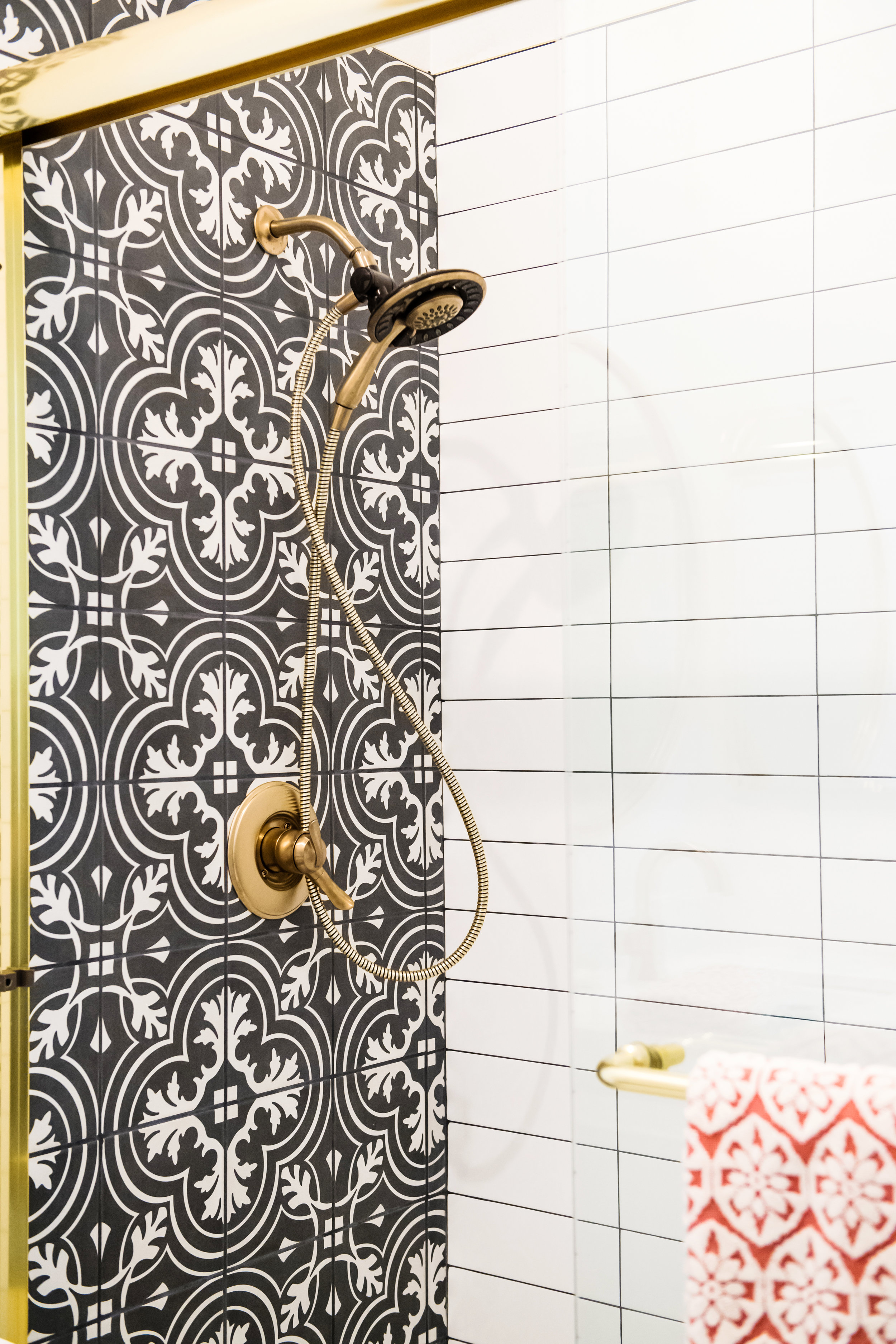
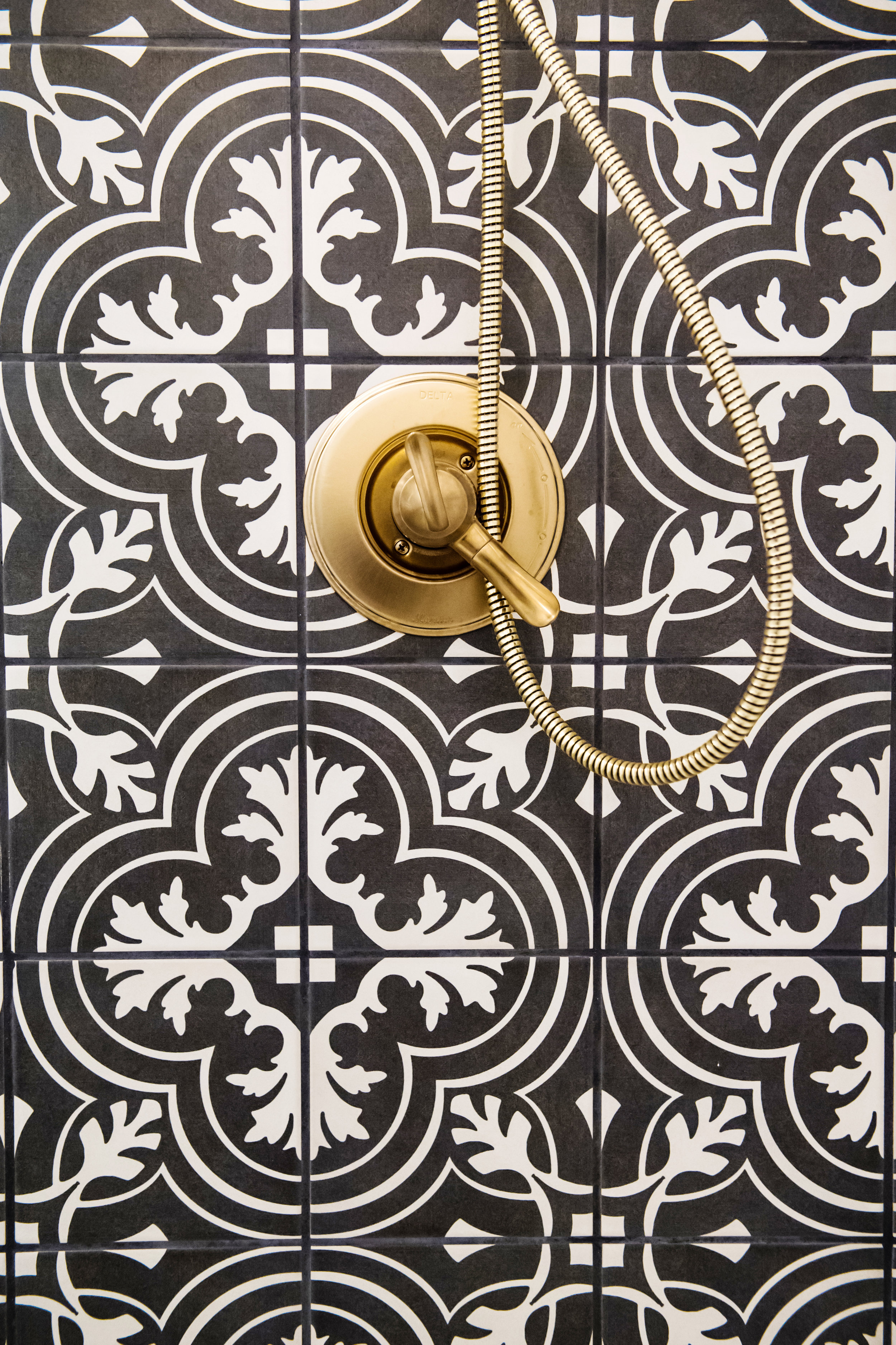
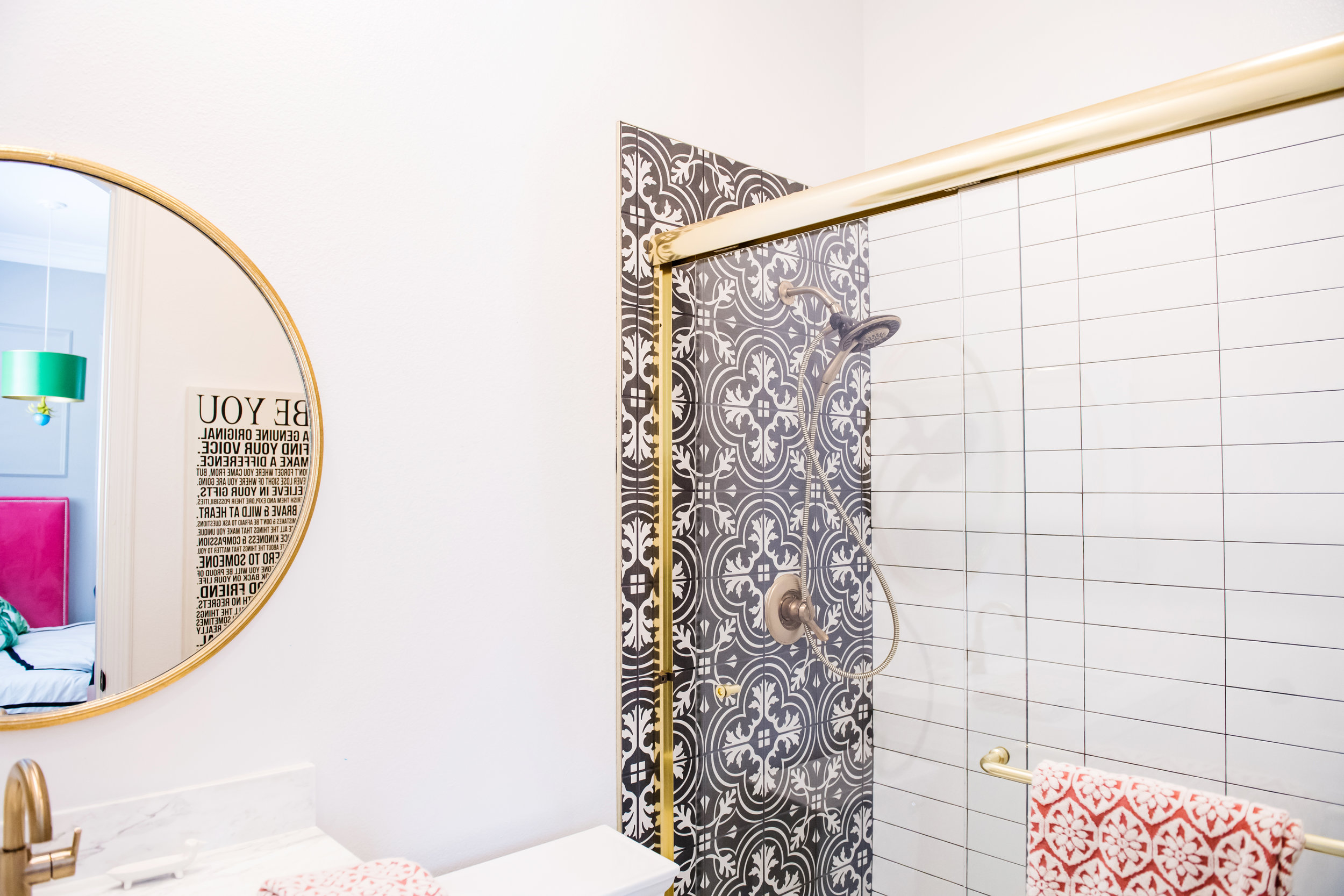
We took this ho-hum standard tract home secondary bath and wanted to glam it out, make the back wall a focal point, but not overwhelm the space. (remember my words, there IS TOO MUCH of a good thing. Graphic tiles are like an unusual flower in a bouquet, they lose their emphasis if you do it everywhere. Balance is the name of the game.
The Approach:
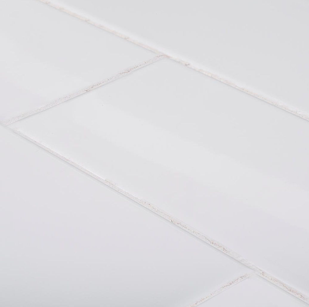
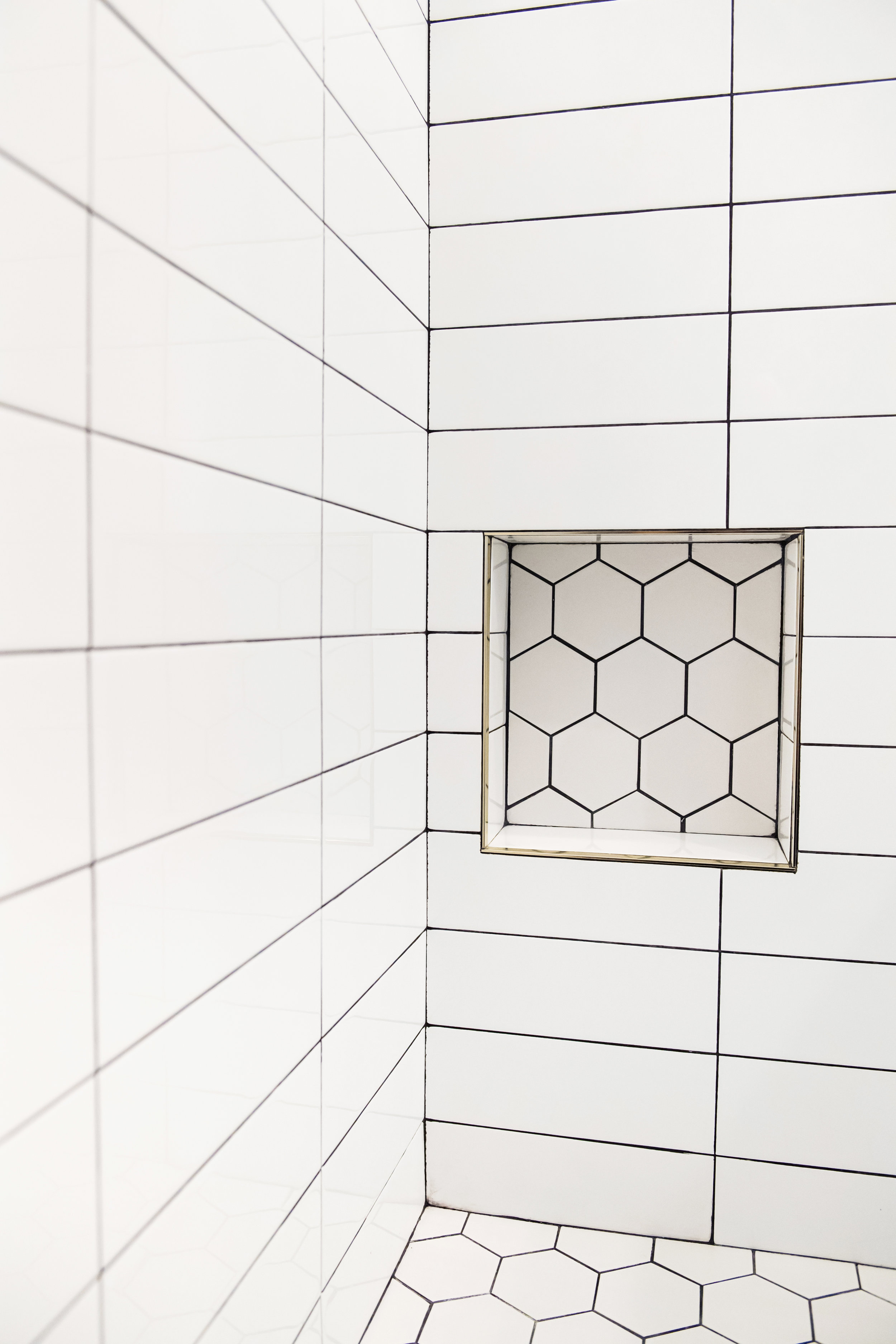
Instead of using this in the whole shower, I wanted to really draw the eye to the back wall and make the coordinating walls as simple as possible. I chose a 4x12 subway tile but stacked with a dark grout. I wanted to see the definition of the tiles and not make them disappear.
For this bathroom for a young teen, we tore out the bathtub and converted into a standing shower. I chose an oversized hex tile for the shower pan and wanted to really outline the pattern on the floor. I used a black glass liner realizing that the foot traffic in there would be minimum. :)
PIN IT!
The Materials
Designer Tip:
SMALL BATHROOM VANITIES
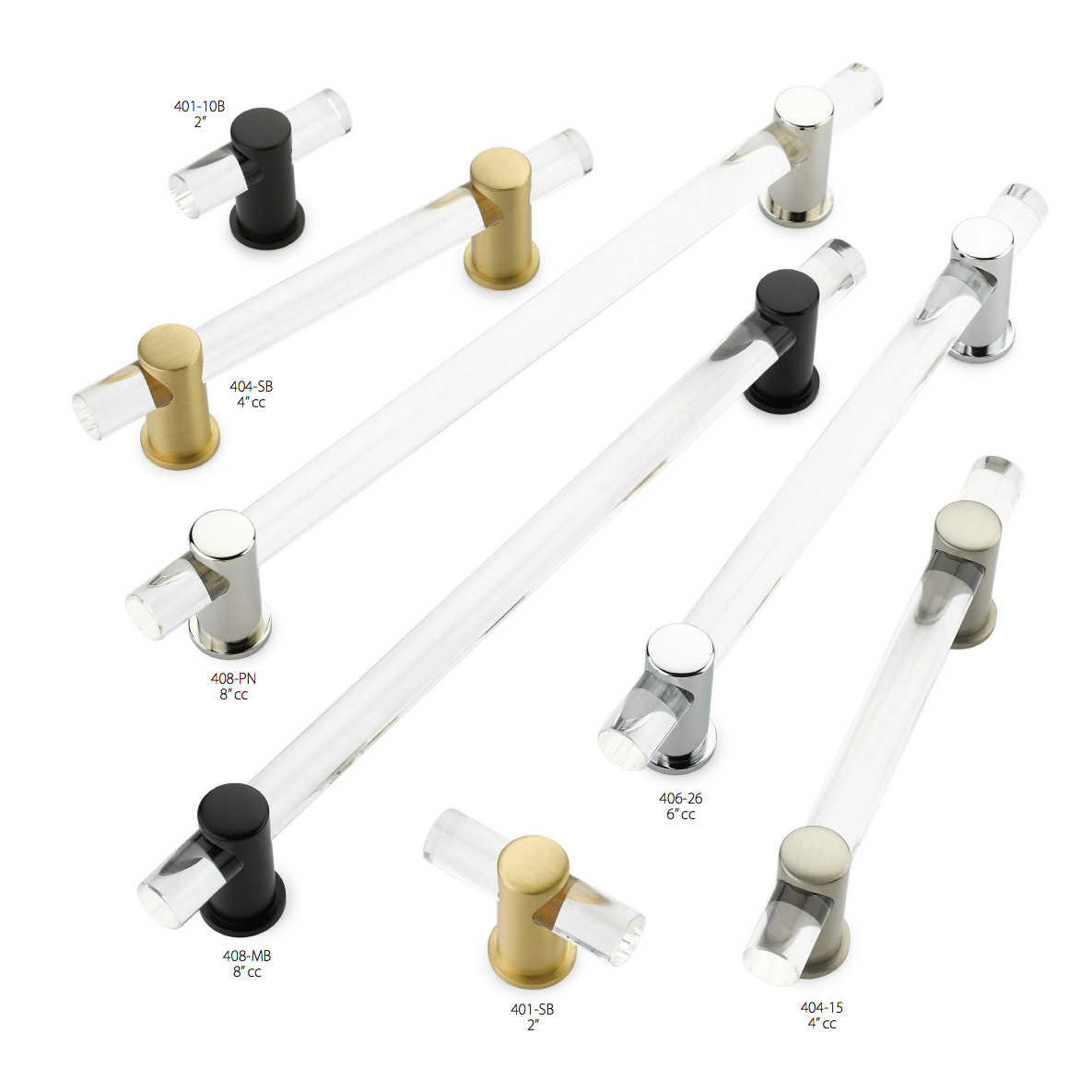
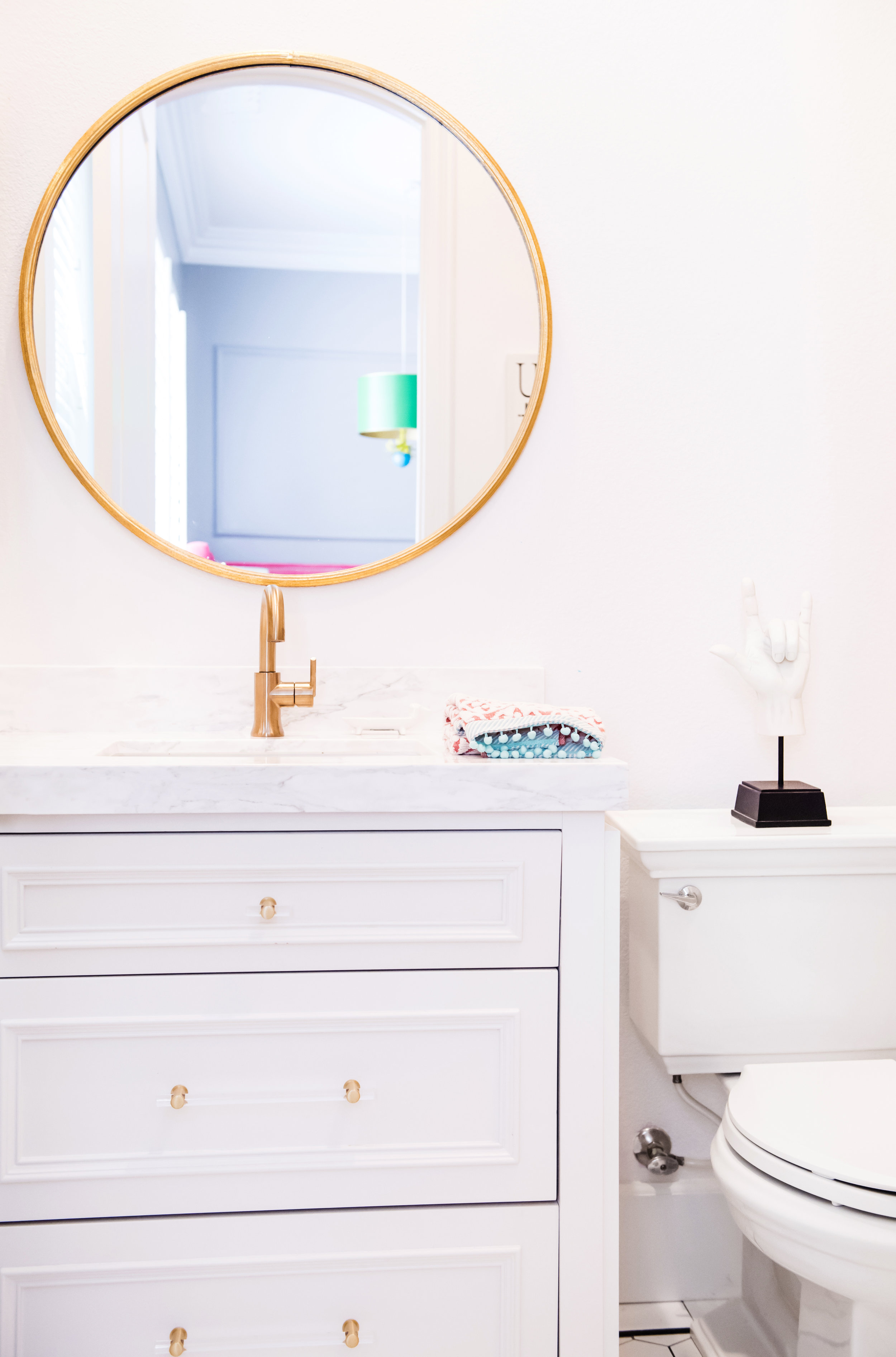
For small bathrooms, I love using drawers on the vanities. The top drawer (generally inactive) tilts forward to hold a simple toothbrush and toothpaste. The other two drawers hold this girl's makeup, hair dryers, and brushes. We kept the medicine cabinet to store all the extras. The white door style with applied molding was elegant and simple. The brass fixtures finished off the 'glam' styling that was important to her.


