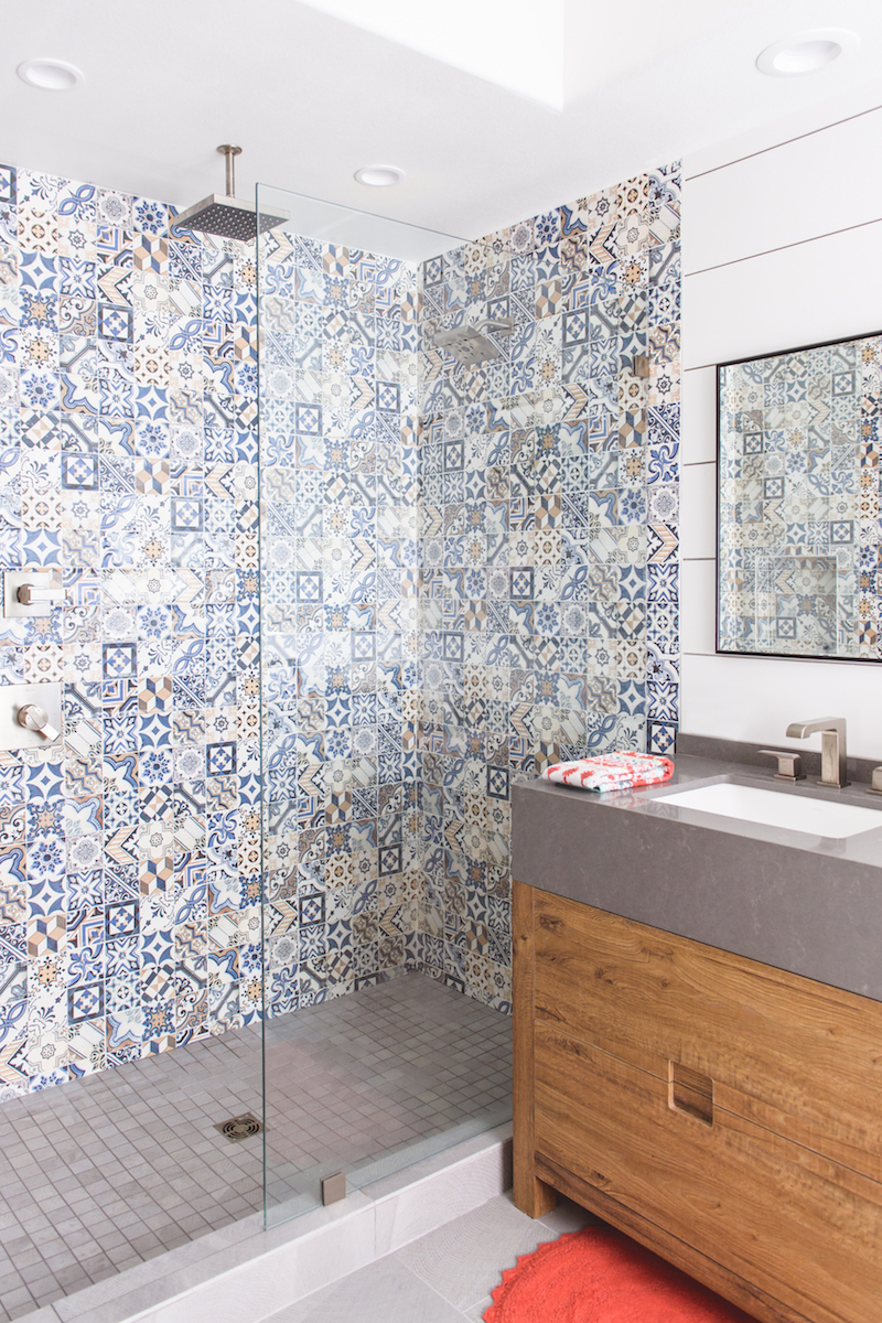
Spanish Resort Style Master Bath Remodel
The Project:
Many tract California homes have a standard builder layout. White or bisque tile, pre-fab shower pans and oversized acrylic oval tubs. We took this Encinitas bathroom design and reconfigured the space to accommodate a freestanding tub, a larger shower, and oversized drawer storage in individual vanities.
The Approach:
We took out the oversized soffit and opened up the ceiling height a bit. We closed off the water closet on one side to create a longer wall for the shower depth on the other side of the room. The homeowner had to "give up to get", one of my favorite sayings, I love how each homeowner can prioritize what is most important to them. I found some inspiration photos that would give them a UNIQUE and nontraditional look. This family likes to travel, visit some great resorts and wanted to make their bathroom feel as though they were on vacation in San Diego. Let's face it, San Diego is a definite vacation destination.
The Transformation
BEFORE
AFTER
The Materials
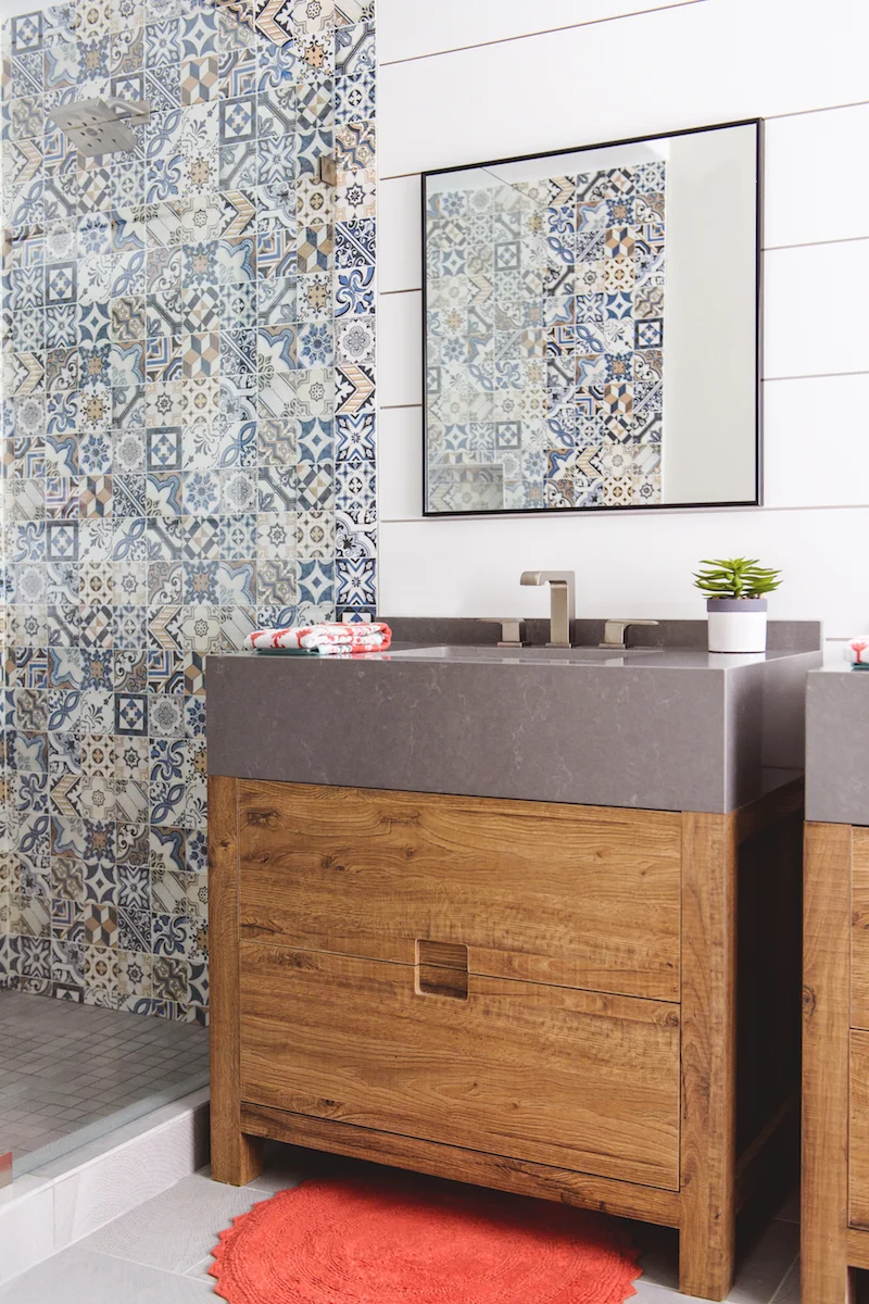
We chose a really fun, densely patterned tile for the shower. Each one feels like it was hand-baked and painted. We used a Schluter for the trim to give it that modern edge detail.
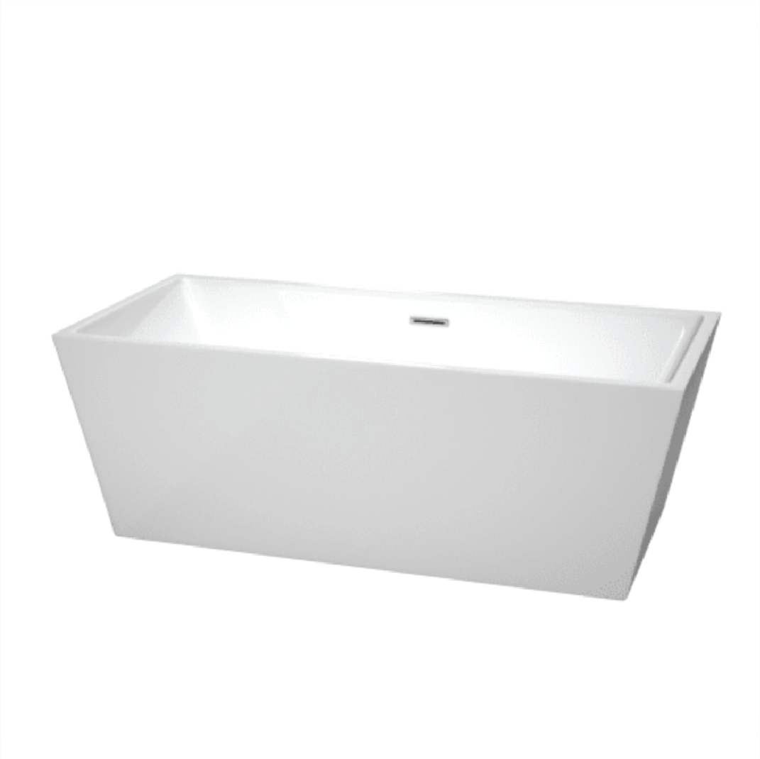
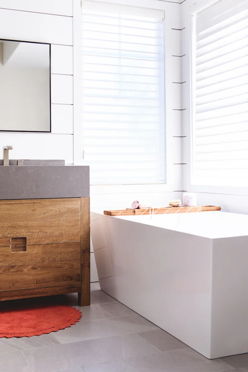
For the fixtures, we wanted a brushed silver to play on the modern edge of this space, along with a squared off tub from Build.com.
One of the best features of this space was the custom vanities we built. I won't lie, these were new to me, using Cleaf and I did take a deep sigh of relief when they were complete. I wanted them simple, push open to avoid hardware. We then fabricated a VERY high profile quartz top. The nice thing about this is it protects the cabinet from water drips as if it's a farmhouse sink. The counter we used is from Pental Surfaces, the Uliano pattern.
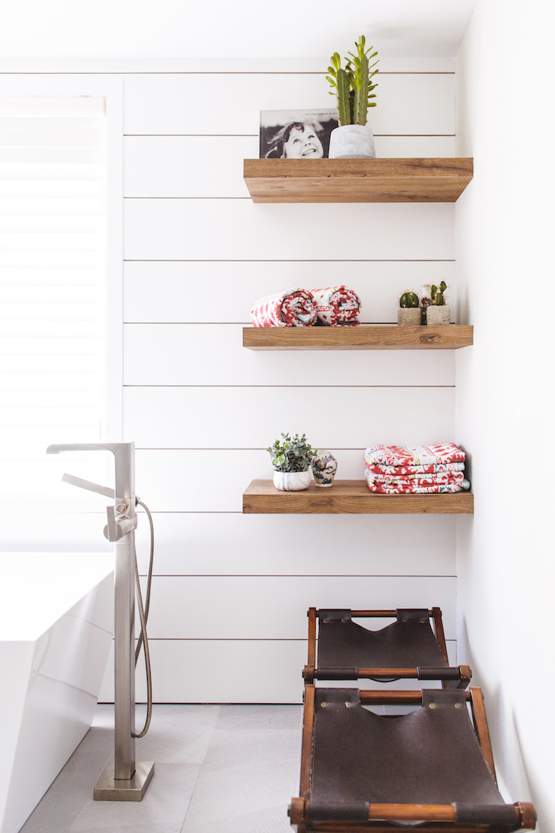
Lastly, for some architectural detail, we added 9-inch poplar boards horizontally installed and painted a bright white. I love that the size of the planks mimics the profile of the countertop. Because the footprint of the old shower left an awkward space, we chose to add some free-floating Cleaf shelves, to host towels, a few plants and some extra storage.
Designer Tip:
Think of your space in a new way, hire an Interior Designer that can think out of the box and move the footprint around. Prioritize what is important, is it the makeup vanity? Storage? Or shower? Be brave and if you are going to be in your home for a while, customize the space to fit YOUR lifestyle and enjoy it.


