What is Spanish Modern?
Like fashion, food fads and Oprah's favorites, Interior Design trends change year over year. Heck, that's what makes them 'trends' isn't it? We recently tackled this Santa Luz kitchen remodel with a take on a current trend we've dubbed 'Spanish Modern.' In this post, we are breaking down the elements of 'Spanish Modern,' the materials we picked for the design, its execution and the final product.
What is Spanish Modern?
Spanish modern is the best update of 'California Tuscan' you can get. In San Diego, homes that were super on trend 20 years ago are starting to look dated. In the '90s everyone loved a good red dining room, travertine everything, granite countertops, many a rooster, and architectural features (even trompe l'oeil... gasp!) that mimic the Italian countryside. Some of this look is still popular and although the masses may have changed taste over the years, it will be a staple in décor.
But, for the new homeowner who's tired of the gold walls, brown granites and dark floors, there's a new style in town. In the design industry, we are starting to see variations of brighter materials, less gloss and more earthy textures. What I appreciate about this style is it blends old and new. Clean lines coupled with the oh-so-popular graphic tiles in both porcelain and cement. The architectural elements of those 20 year old California Tuscan homes can remain, and a modern facelift makes them feel not so dated. Balancing out the natural in exchange for the ornate is where the focus seems to be for now. We are starting to see more vintage and brightly colored rugs, honed quartz finishes, natural honey woods (remember when that was out?) and beautiful Spanish looking tiles.
“Spanish Modern is really a contemporary take on the 1990’s and early 2000’s California Tuscan.”
Picking the Right Materials
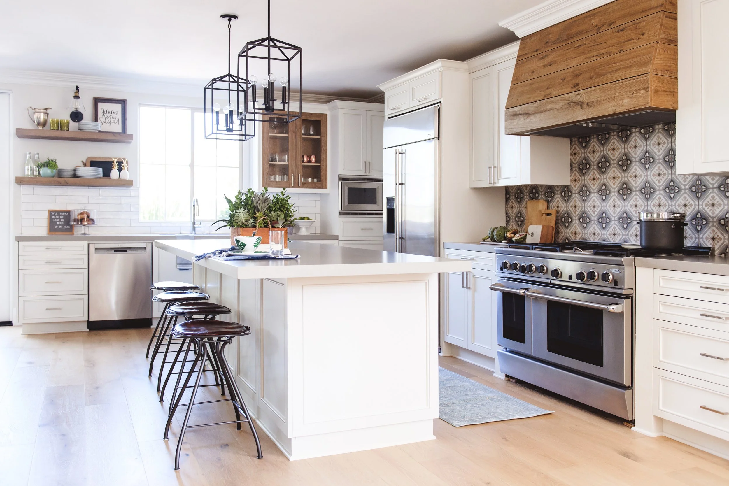
We recently updated this kitchen in a Spanish style neighborhood in Santa Luz California with this Spanish Modern remodel style in mind. Light oak floors replaced the distressed dark ones unifying the family room and kitchen. We swapped granite countertops for a honed (meaning not shiny) quartz from Pental in a warm cement-looking gray.
We knew we wanted to open up the window area to the backyard so we opted for the oh-so-trendy 'floating' shelves. For this project, we used a laminate called CLEAF to create the reclaimed wood looking elements on the hood and floating shelves. Loved it. You'll get the look of a natural wood without the maintenance or hassle. We staged the shelves up with some simple usable pieces and then matched the reclaimed wood look on the other side of that wall by using it as an accent on the glass paned cabinet doors.
The whole space really came together thanks to the Spanish-influence pattern tile as the backsplash behind the cook top.
Designer Advice: Don't Overdo It
Pattern can scare some people. The key to using detailed pattern in a space like your kitchen is to give it enough room to shine. What you don't want to do is plaster it all over the place. To make this graphic feature really pop in this kitchen remodel, we used it only behind the cooktop, then complimented with a simple hand-modeled looking subway tile for the rest of the space. Sometimes, too much of a good thing will make your stomach hurt (like too much candy corn). If you've got too much pattern going on, you will have a visual tummy ache.
THE BEFORE
Trusting your Designer: The Remodel Process
To give you a better idea of the kitchen remodel process, I sat down with this client and asked her the following:
When you bought your new house, did you know right away what you wanted?
No, not at all! I knew I wanted a light and bright kitchen since our old home had a dark kitchen. The kitchen extends into the family room, so I wanted it to feel comfortable and not be too obtrusive. The house has a Spanish bungalow feel to it so I wanted to keep the integrity of that style but not use heavy iron and woods in order to accomplish that look. I knew I wanted a bigger island…that is about it!
With all the graphic tiles coming into popularity right now, were you worried? How did you decide which ones you wanted to use?
At the time, graphic tiles were just starting to pop up on my Facebook feed and it really did not have an influence on our decision. None of the other current tile/backsplash options seemed to fit well with the look we were trying to accomplish. I must have spent 10+ hours looking at graphic tiles, online and in stores. I was going nuts! Thank goodness Susan went with me one day. It took 10 minutes for her pick the perfect graphic tile.
With the hood design, we used a Cleaf material in a horizontal shiplap type of pattern. How do you like the mix of the wood and white?
I was worried with EVERY decision we made! I loved the idea of incorporating wood accents but was a little worried the hood would look too trendy since wood/shiplap is EVERYWHERE….but it is stunning. It adds texture, definition and a pop to that space. It helps break up all the white and accents the tile. I love it. It is another example of trusting the designer!


