Kid-Proof your White Kitchen
THE PROJECT:
Last Spring, early summer we began working with this family on some new flooring and some new kitchen ideas. She loves the whitekitchens and she actually really liked her footprint with the peninsula for “Pizza” nights when her husband lines up their 5 kids and they watch him make pizza.
THE APPROACH:
When we first started, she really wanted a white kitchen. To break up a sea of white and to bring in some visual interest we thought about bringing in textured woods which turned out to be our perfect solution. One of the biggest worries with white kitchens is keeping them clean. When you have little ones, you're going to deal with fingerprints, grime, you name it. To mitigate it, we decided to go with textured wood on the bottom and, well... you'll see. :)
THE BEFORE:
Step 1: Add Height
The first thing we did was take the cabinets up to the ceiling with some light boxes to make it feel a bit taller. It used to be that we would decorate above-the-cabinets with accessories, silk plants, etc. but if your ceilings are fairly low, you really don't need it. Taking the cabinets all the way up is also a much cleaner look.
What to Expect
Our Cabinetry Installation Guide
Step 2: Flooring
Then, we selected the flooring tile. This was going to set the tone for the space color wise. We selected a wood plank tile to replace the existing square, cream colored tile.
Step 3: Design Draft
I spent some time drafting up the kitchen with our cabinet maker and playing around a bit with the elements and landed on a knotty alder wood that can have the natural distressing that is so pretty today.
When selecting a cabinet finish stain, I think gray beiges are the hardest. Sometimes you can get a lavender and other times a pinkish undertone. We like to prepare "strike off samples" (a smaller stain sample done as a 'one off' to give you a sense of tone, coloration and complexity). I knew we wanted to blend the cabinetry with the tile, but pulling one single color from the tile we used would have been impossible. Instead, I requested to match one of the more solid colors in the shade we were after, and had it matched. Overall, it was slightly lighter than the floors, which was just perfect to lend enough contrast to the space and not end up with one big blob of gray-brown.
Storyboard presented to client for proof of concept
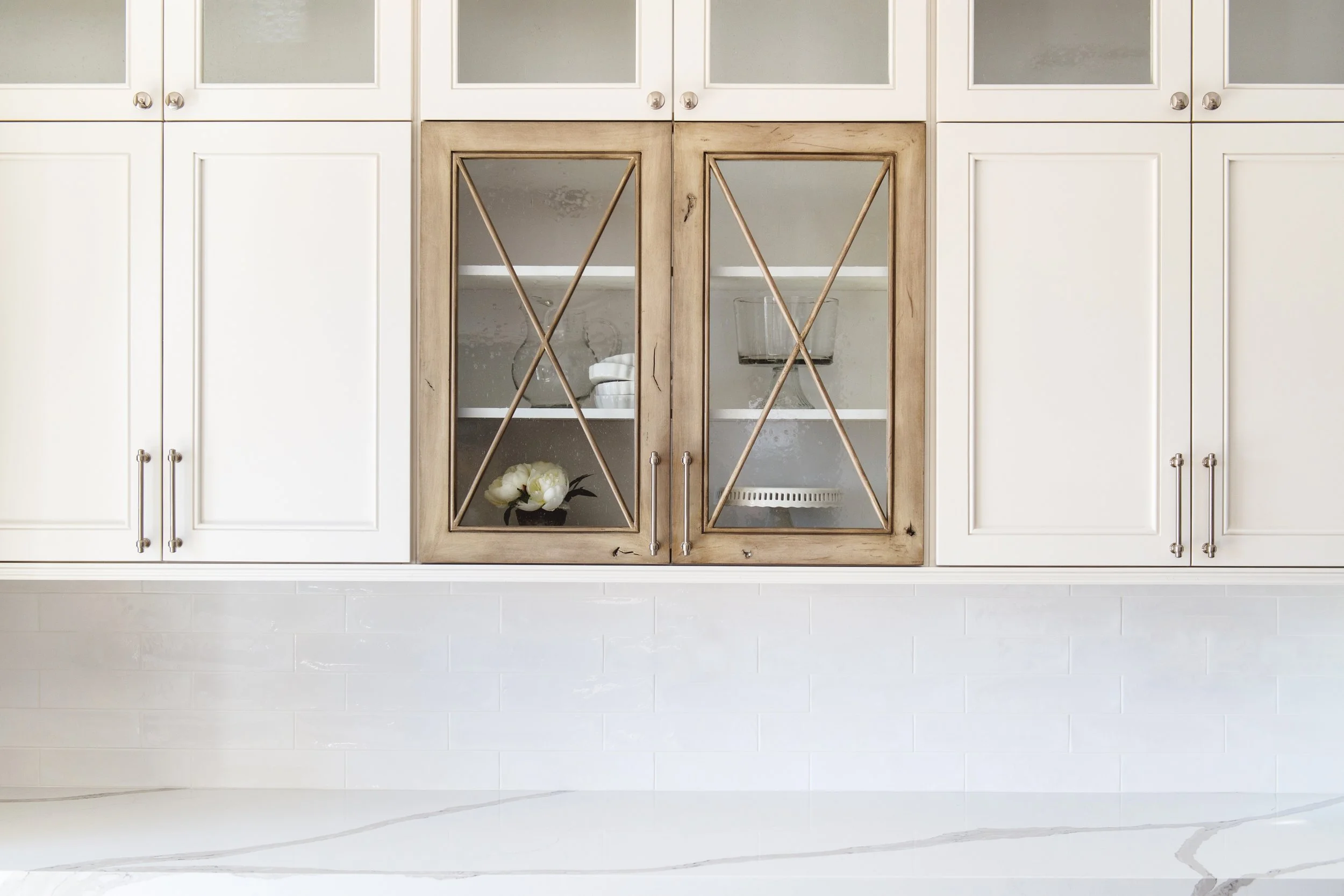
We nixed the small desk area in her kitchen, but I wanted to preserve the visual interest and symmetry of the space. To do this, we created the illusion of a mock buffet. By laying out the space and utilizing oversized drawers, this became a focal point as soon as you turned the corner. The glass cabinets with the accented X trim matching the base color stain immediately draws your eyes up. In the "before kitchen" there were too many sheer glass cabinets that made the space feel cluttered. This simple set of doors adds a bit of fun and breaks up the wall of cabinetry without looking too cluttered or out of place.
Next step was colorizing our layout to get the visual of how it would all come together.
Auto-CAD mock up
Step 4: Kid-proofing
For the peninsula, we took out the existing pony wall and replaced it with deeper cabinets and added a shiplap type paneling on the back side. Since 'pizza time' was a regular occurrence in this house, we were cautious about kids feet and dirt and grime on the underside of the island.
No worries now of kids kicking the back side during pizza time.
MATERIALS:
Build.com faucet
Atlas hardware (in brushed nickel to show less fingerprints)
Pental Quartz Countertop (in Arabescato pattern)


