Coastal Master Bedroom: When to 'Splurge' vs. 'Save'
All photos by Dandelion Dreams Photography
THE PROJECT:
I often tell clients that besides your kitchen, a master bedroom is where you want to go and be at peace, give yourself a time out and wake up to a beautiful space. Most of the time, I find it’s put at the bottom of the priority list because “nobody sees it”, to which I reply, YOU see it every night before you go to sleep and the first thing you wake up to.
When I set out to design my new master bedroom, I wanted to achieve a soothing, textured, contrasting transitional, coastal look that would allow me to relax in the space.
THE APPROACH:
This master bedroom is what I would call a hybrid budget approach. What is hybrid design? It’s meant to reflect one of my favorite sayings:
“What are you willing to give up to get?”
It means there are items that are splurges, and items that are saves. It means combining a few customized pieces, some longer term investments mixed in with some Target and Homegoods finds to balance it all out.
THE PROCESS:
Step 1: Paint and Carpet
A neutral palette allows you to pull in color in accents. I chose a pale winter white paint color called Vista White from Vista Paints. This is a great color for cabinetry. For carpet, we selected a textured geometric nylon carpet in a pseudo-greek key pattern.
What to Expect
Interior Paint Guide
Step 2: Furniture
A simple linen custom-made headboard is the anchor for the space. The color ever so slightly contrasts the walls with combined cream and gray undertones. With generous sized closets, there was no need for a full size dresser in the room. Given the width of the back wall, we went with two bachelor chests from Noir that are about 45” wide. These pieces are solid construction, and are definitely built to last, making them a bit of a splurge. Not every space can accommodate this large of chests as side tables, but in this space, they match the scale of the Cal Kind bed, and extra storage on the sides is a bonus. The bed is capped off by a custom hair-hide (painted zebra) bench. The bed, side chests, and custom bench were my three highly custom splurges.
Step 3: Bedding
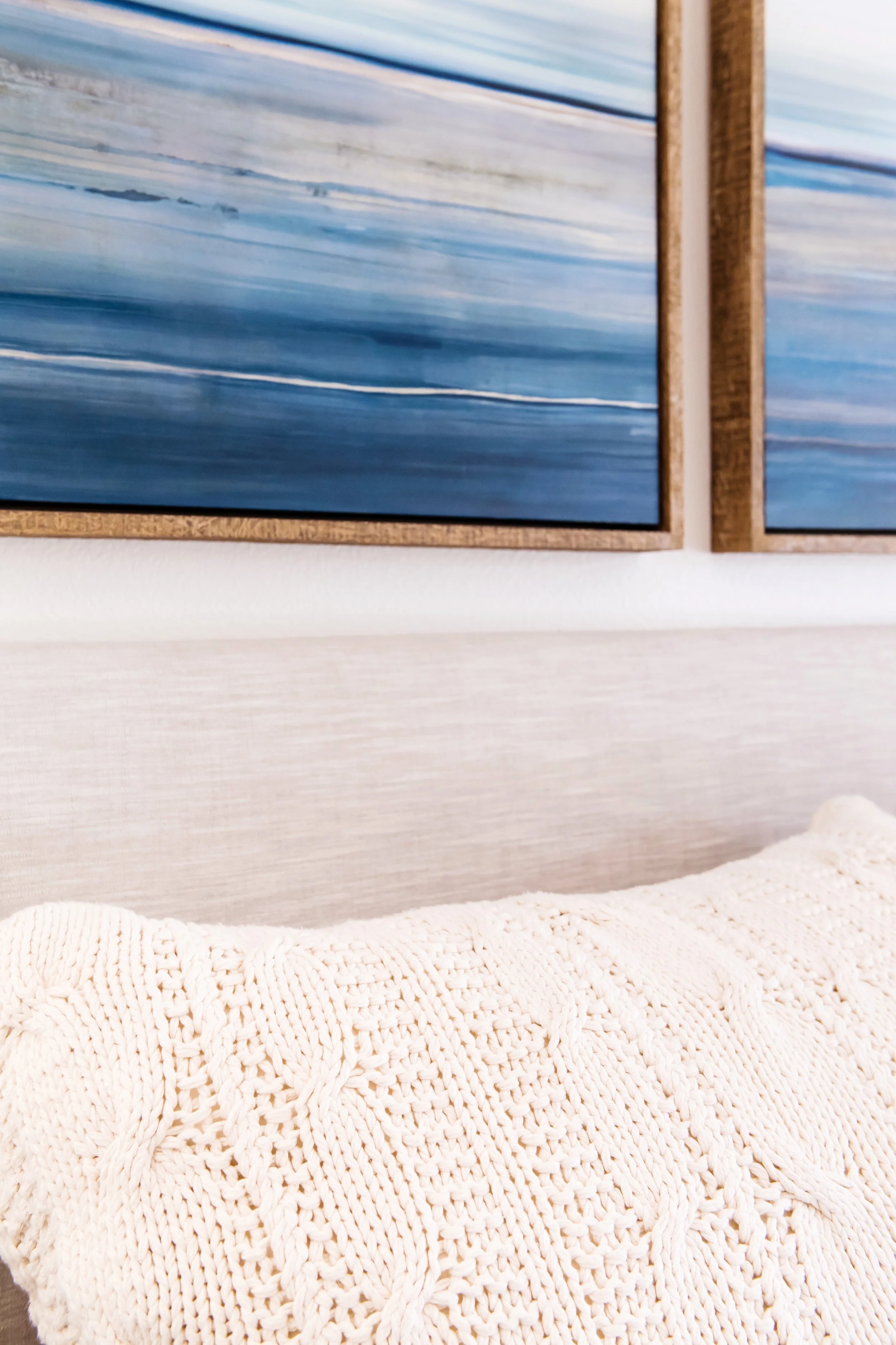
For the bedding, it was all about the simplicity and the texture. I ADORE the knit Dutch Euros from Amity Home bedding. They are super oversized and larger than a King sham or a Euro Sham. With down blend inserts, they are the most comfortable shams to sit up and read in bed on (ok, lets get real, I never read in bed but I do like Hulu and Netflix). The are a splurge, but they are totally worth it.
For some contrast to the cream colored knits, I saved by choosing a Threshold by Target coverlet in Navy Blue washed velvet with diamond stitching. Saved again by choosing lamps from Homegoods, because let’s face it, you can’t beat their lamp prices.
Step 4: The Finishing Touches
Once I had all of these elements selected it was time to find the “unifier”. A "unifier" is the piece that ties all the design elements in together. This can either be an area rug, a pattern in a bedding, or artwork. I chose the artwork over the bed from Leftbank Art, a wholesale art supplier. I wanted these companion prints to have an organic and simplistic feel. These are canvas prints with a rustic aged driftwood "floating" frame to pull in the wood from the side chests.
THE TAKE-AWAYS:
When designing your master bedroom consider this:
SPLURGE: custom upholstered bed, solid construction side chests, plush pillow covers and inserts
SAVE: on-trend coverlets, inexpensive lamps, accessories, unifying artwork
THE FINAL PRODUCT:
The simplicity of the space allowed me to achieve a peaceful retreat, one that kept budget in mind, but gave us a few pieces to hold onto for years to come. And if Target comes out with a Emerald green coverlet, well, I might just swap it out and get some fun new artwork to unify the space.


