An Elevated and Updated Spanish Modern Vibe
The first step to any remodel is looking at the architecture of the home. So many of our projects feature traditional Spanish modern architecture with a Tuscan style. This aesthetic can feel monochromatic and dated with its travertine tile, gold and brown tones, and arches everywhere.
What is Spanish modern?
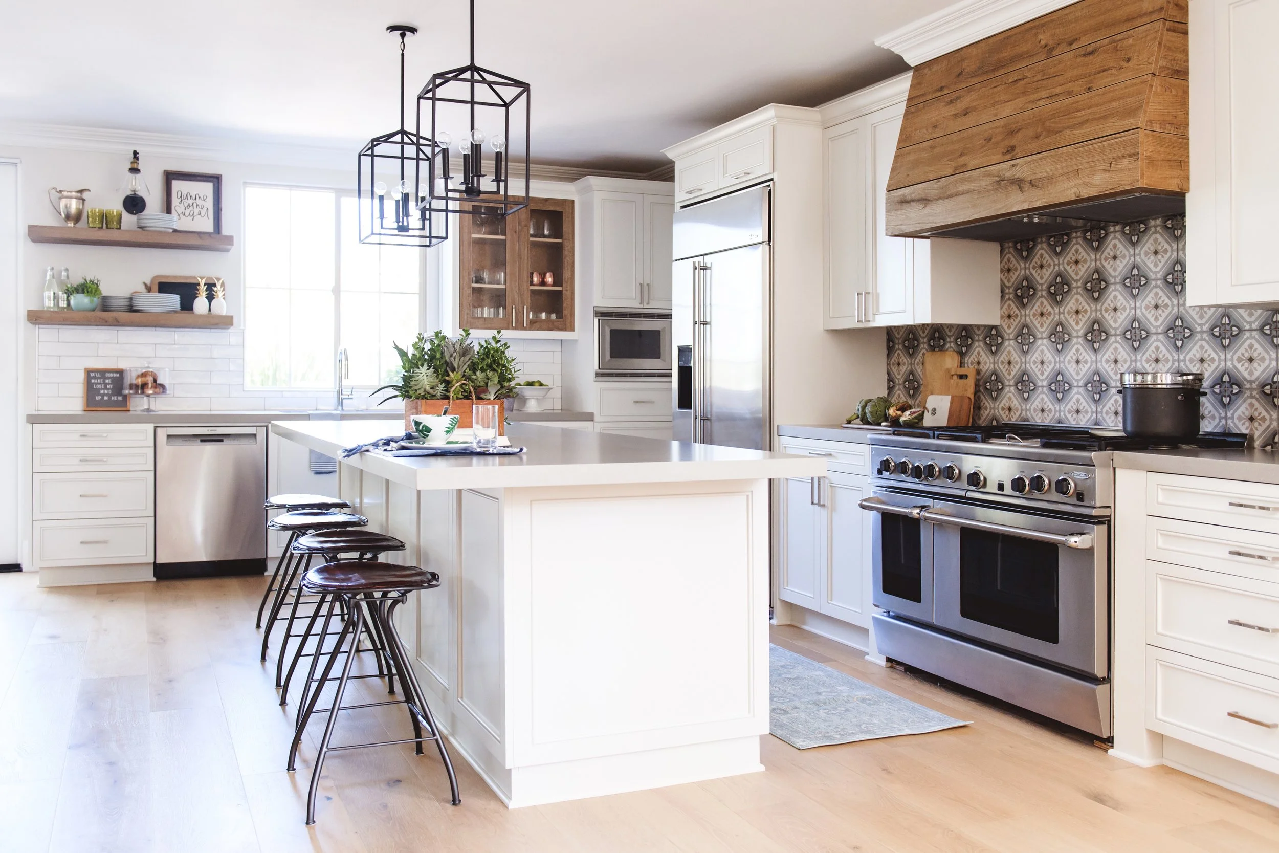
We believe Spanish modern is the way to update 'California Tuscan'. A warm, yet natural palette brings together terracotta and notes of blue. Spanish-style tile adds drama and pattern, but with clean edges and a modern twist. This is where earthy warmth meets modern day style.
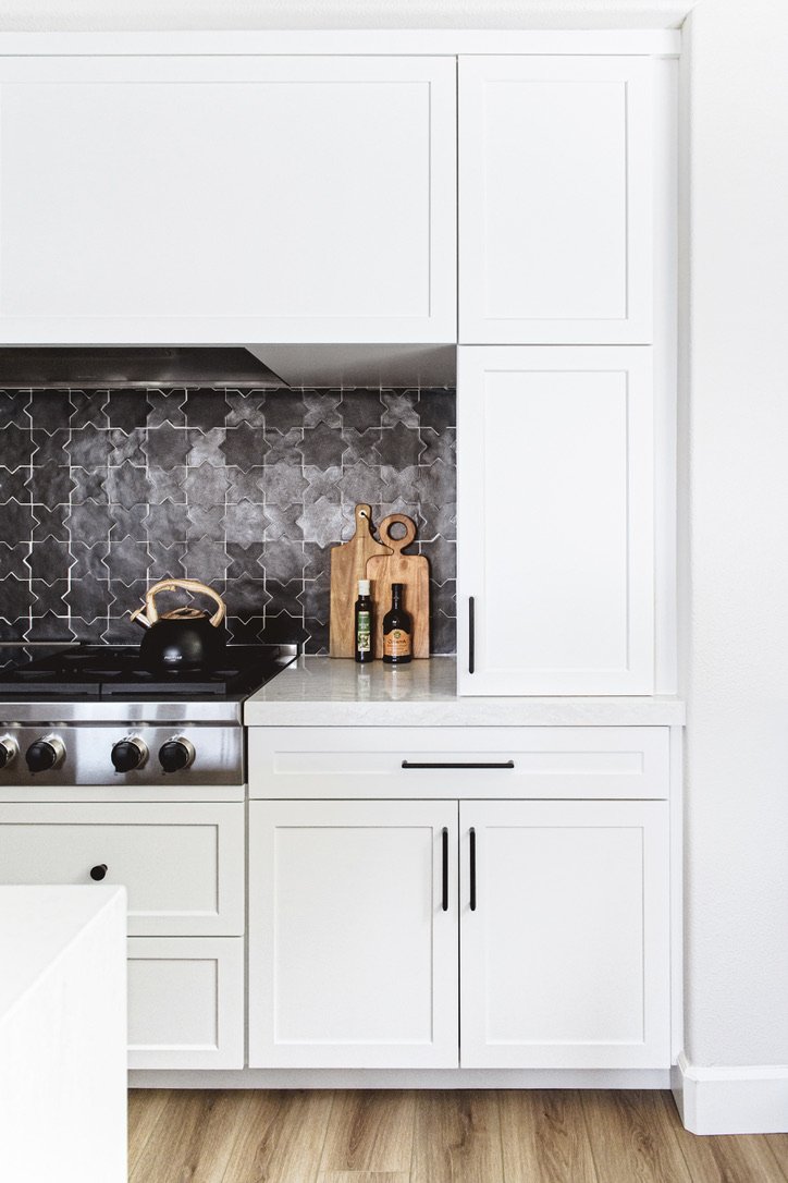
The Spanish modern style can come together in whatever way best fits the home, its architecture, and the needs of the family. Graphic details can mean a bold, patterned tile with notes of warmth or an interesting tile shape in a rich, contrasting color. Finishes layer in texture and drama, without overwhelming the space with design details.
This aesthetic seamlessly combines the light and bright airiness of California living with the warmth and eclectic details of Spanish-inspired design. It’s the best of everything because it feels current and modern with its neutral palette and classic wood tones, but also timeless and homey.
Retaining & refreshing
It's not about erasing what the home was. Instead, our goal is to reinvent the aesthetic for better function and flow. It’s possible to curate a vibe that feels elevated and modern, while staying true to the Spanish roots of the home.
You can remodel in a way that retains what you love about your home. It’s about refreshing what no longer works, and curating a look that feels modern and inviting. That’s exactly what the Spanish modern style is all about.
Elevating the aesthetic
The Tuscan style can feel overly ornate and formal, which doesn’t fit with the way many families live and move throughout their homes. But updating a Spanish-inspired home to a more modern vibe is simple.
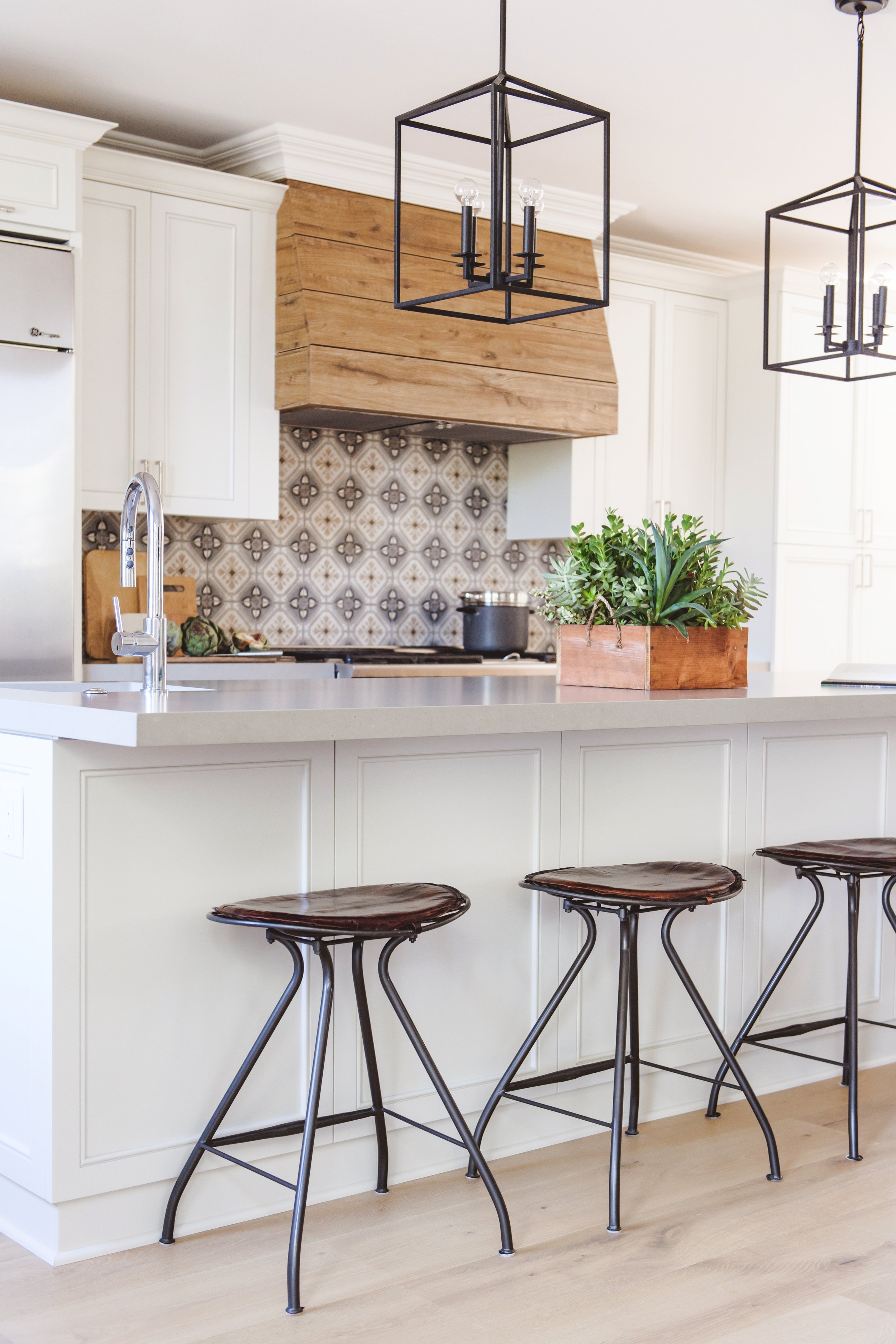
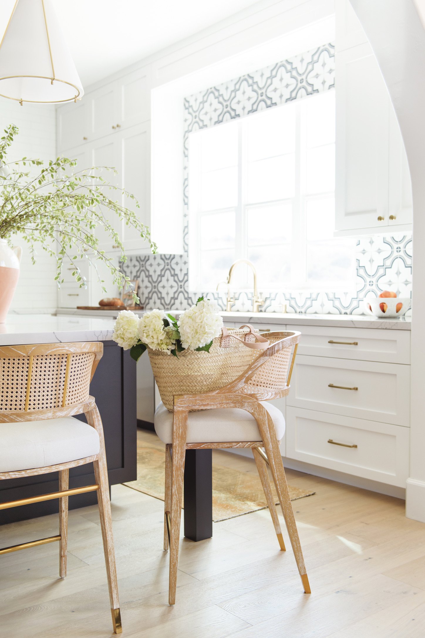
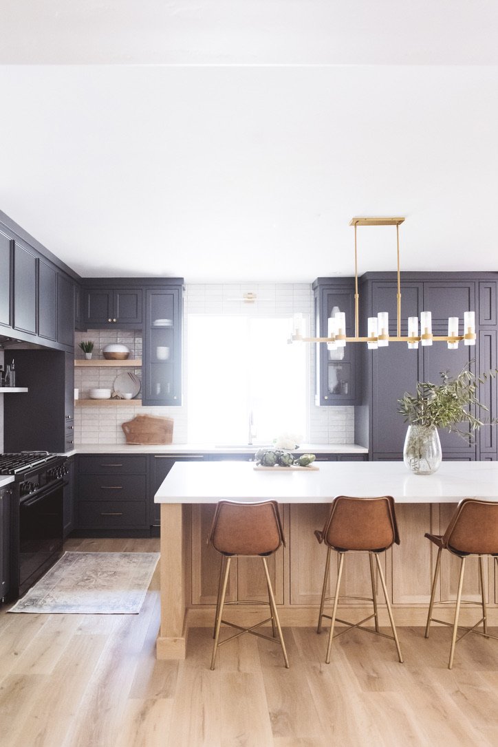
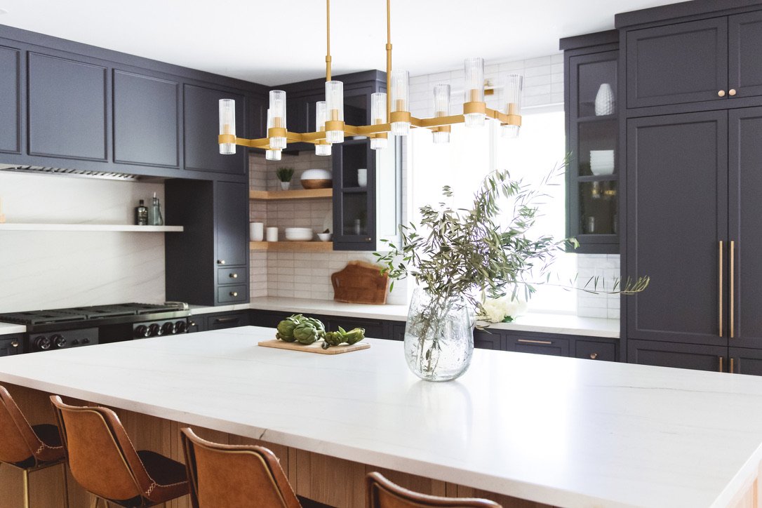
Start by incorporating contrast with notes of deep, rich color. Think terracotta, muted greens, and shades of blue. Next, mix lights and darks. A light wood floor pairs well with a bold cabinet color. Use graphic accents to draw the eye. This can take many forms, from a patterned tile around the range and hood, or outlining a long, modern window with a view. When the palette is largely neutral, bold choices balance and ground the space.
Keep it simple & classic
When updating a space like a kitchen, it’s possible to do too much. You have to start by prioritizing where you want to make a statement and then integrate neutral elements to create cohesion throughout.
Pattern is essential to the Spanish modern vibe …
but use graphics sparingly. Pattern selections should create a focal point instead of overwhelming a space.
Think classic lines, simple textures, and more modern materials …
to offset a traditional feel. The best homes mix styles seamlessly to create an aesthetic and a feel that is personalized, yet functional. When you stay true to the architecture of the home, there is room to add more of what you love to make the space your own.
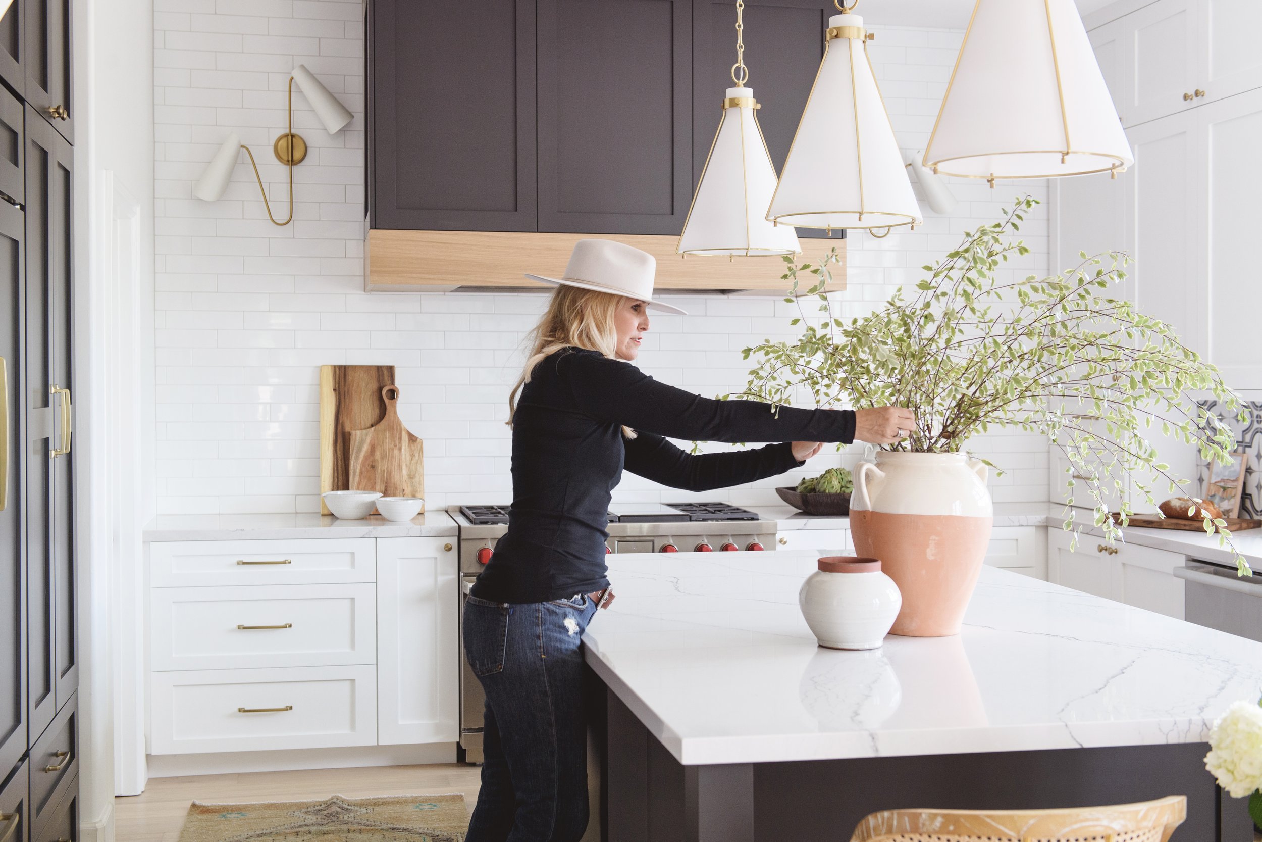
At Savvy Interiors, a hallmark of our kitchen designs is a custom hood. It’s a natural focal point and a functional feature in a space that is often the hub of the home.
Lighting is another way to spice up a space and further elevate the Spanish modern vibe. An innovative, modern chandelier is functional and bespoke. It’s the cherry on top of a well-designed space.
When it comes time to remodel, there are so many ways to update and elevate a home. We would never lay claim to one style because … we LOVE them all. Curating home is about mixing styles in a way that brings out what the homeowner loves in their home. It’s about paying attention to the details that matter, the original architecture, and inherent charm, to elevate what the home can be.

