Creating a High Contrast Kitchen Remodel
Photos courtesy of Dandelion Dreams Photography
A High Contrast kitchen ... music to our ears!
This music teacher and professional musician came to us for a full kitchen remodel after purchasing their beautiful home in Santa Luz, the neighborhood in North County San Diego. With so many white-on-white kitchens under our belts (see our Kitchen Portfolio) we were more than ecstatic to try something new with this space.
The Project
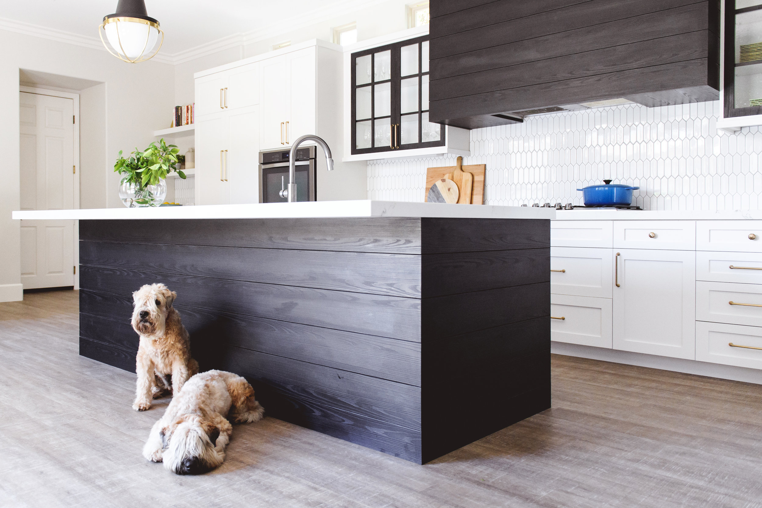
When we first met this client, she expressed that she wanted her new kitchen to be comfortable and relaxed (our favorite style as well). The style of the home overall, like many in Southern California, was very Tuscan-inspired with oversized travertine tile, rounded corners, and arched entry and doorways. The remodel needed to stick somewhat to the existing style. Lastly, our client mentioned that she wanted materials that were going to be easy to maintain. She has two adorable Wheaton Terriers.
THE BEFORE:
As you can see, the previous kitchen was very stereotypical Tuscan tract home. The honey toned cabinets create a wall of food and the dark granite and muddy wall color make the whole space feel much smaller than it actually is. Last time, we blogged about Kitchen Island Lighting, and these three small pendants spanning the space needed a fresh update.
The Design Inspiration
As a music teacher, our client's piano is really the heart of their home. When brainstorming this kitchen remodel, we riffed off the black and white of piano keys, accented with soft metallics to create a unique and personal look for their home. The design moodboard we presented addresses the clients needs and gives us a sense of direction when selecting materials.
The Materials
When selecting the materials for this project, we wanted to ensure that the surfaces would be easy to maintain.
FLOORING
We opted for a US Floors COREtec? COREtec is a great choice for this client because it is significantly cheaper than regular hardwood, more durable (remember she's got two cute doggies!) and water resistant, which makes it great for kitchens.
Interested in COREtec for your space?
CABINETRY
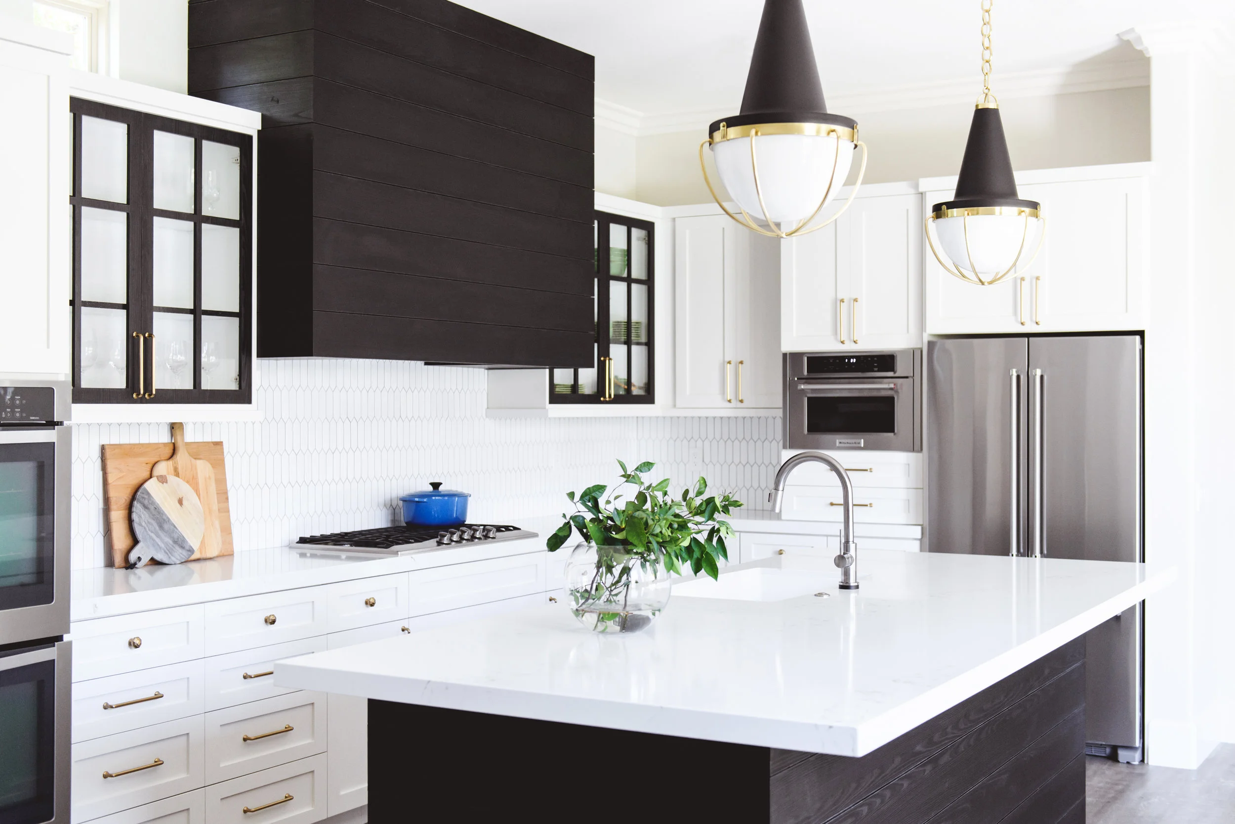
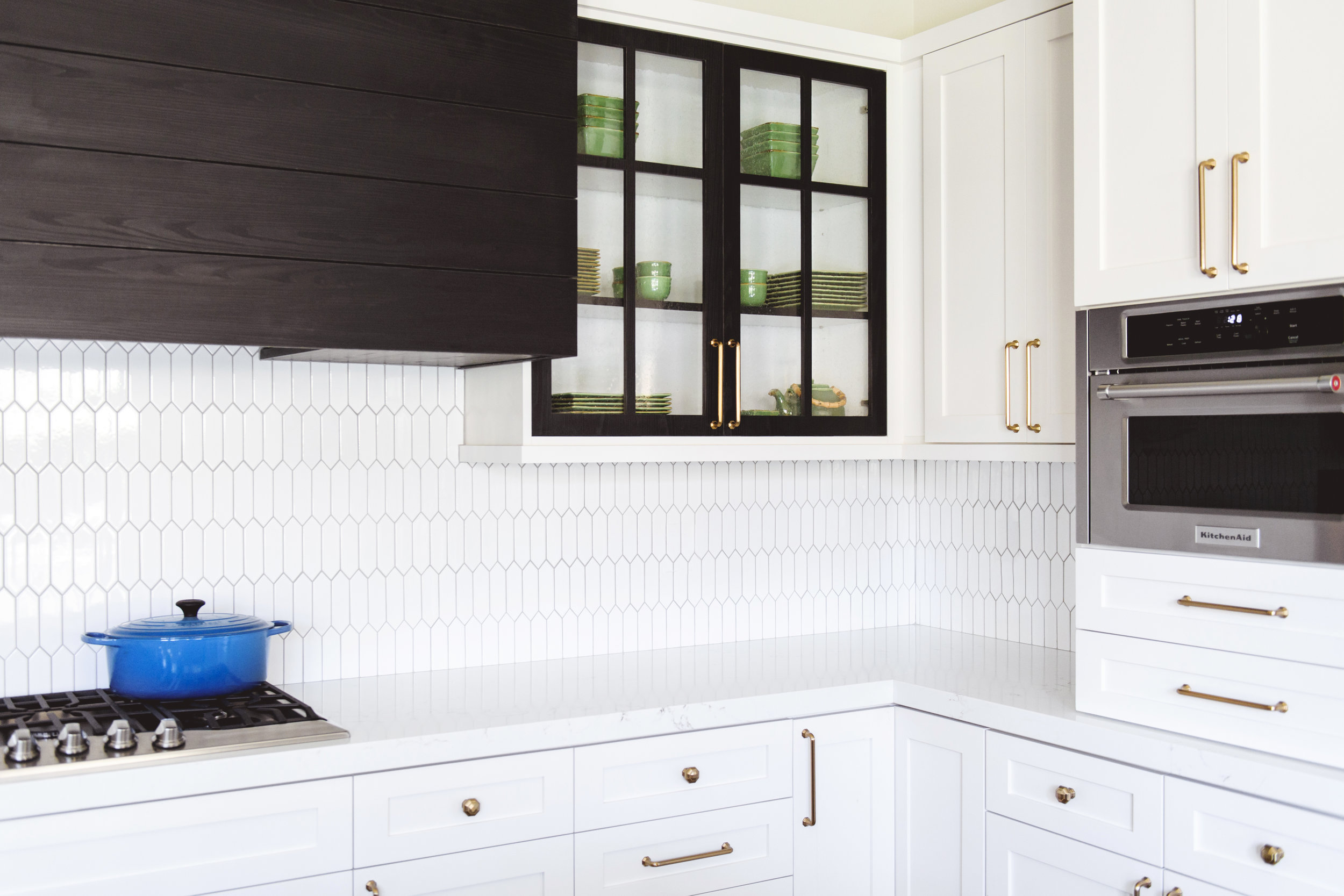
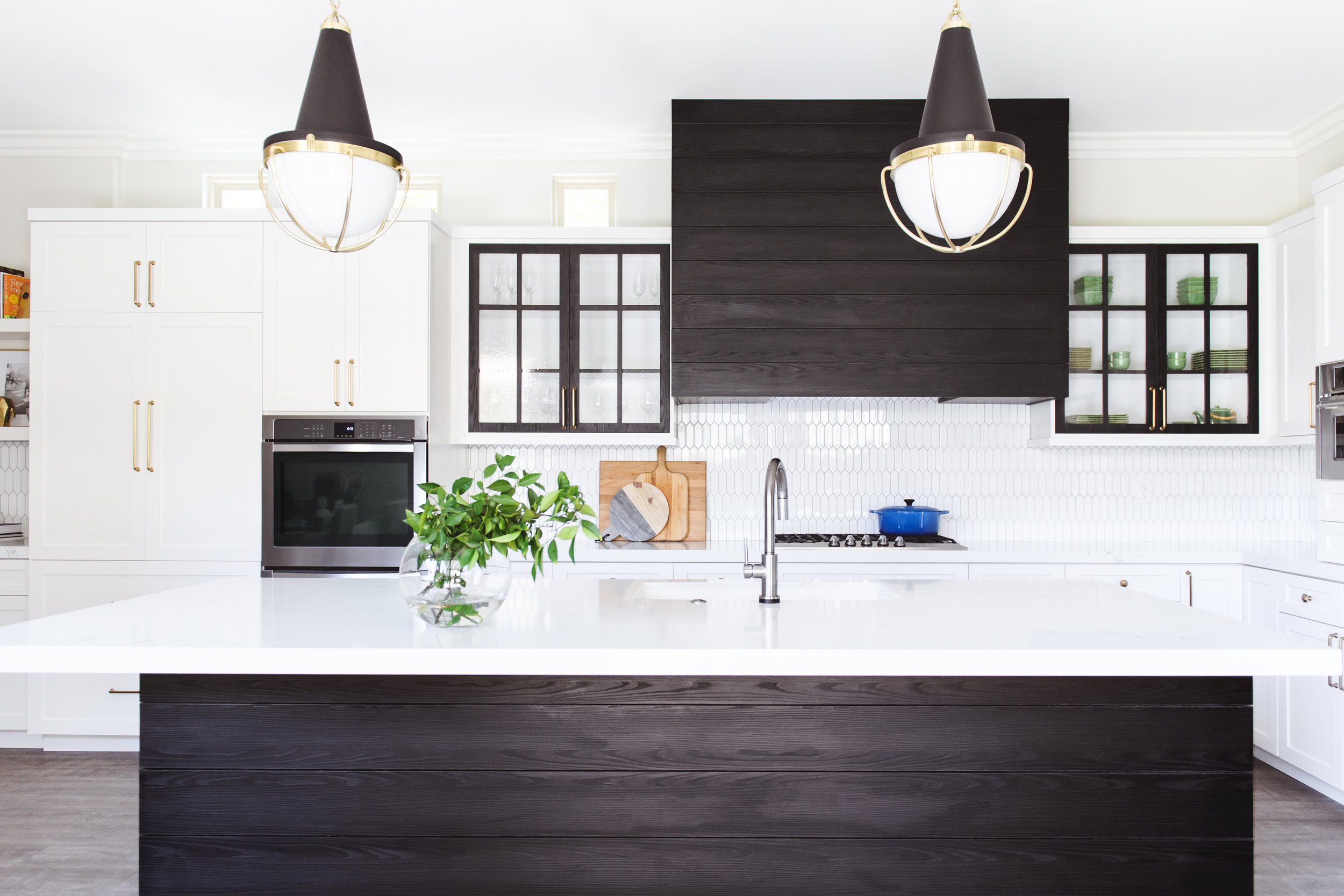
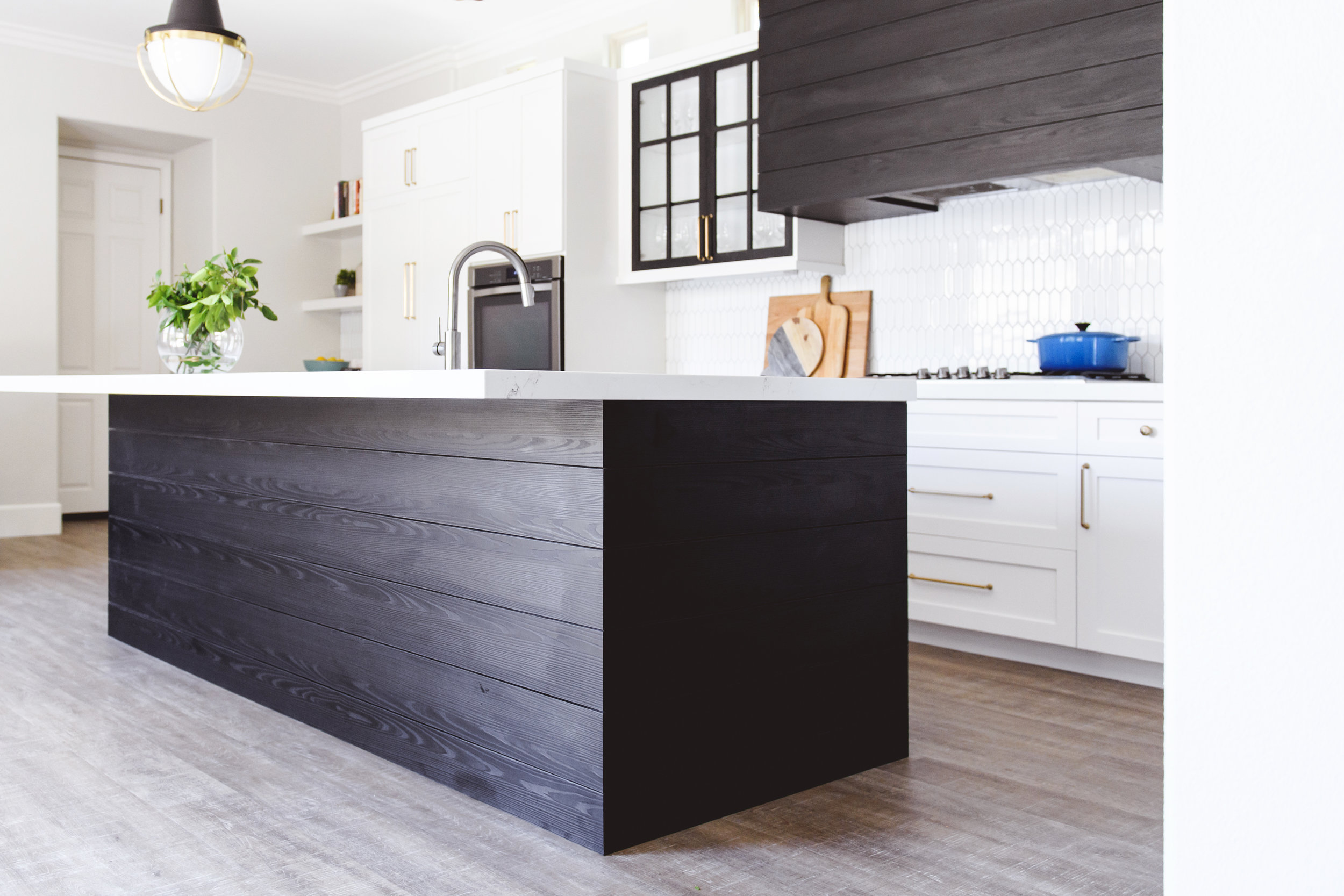
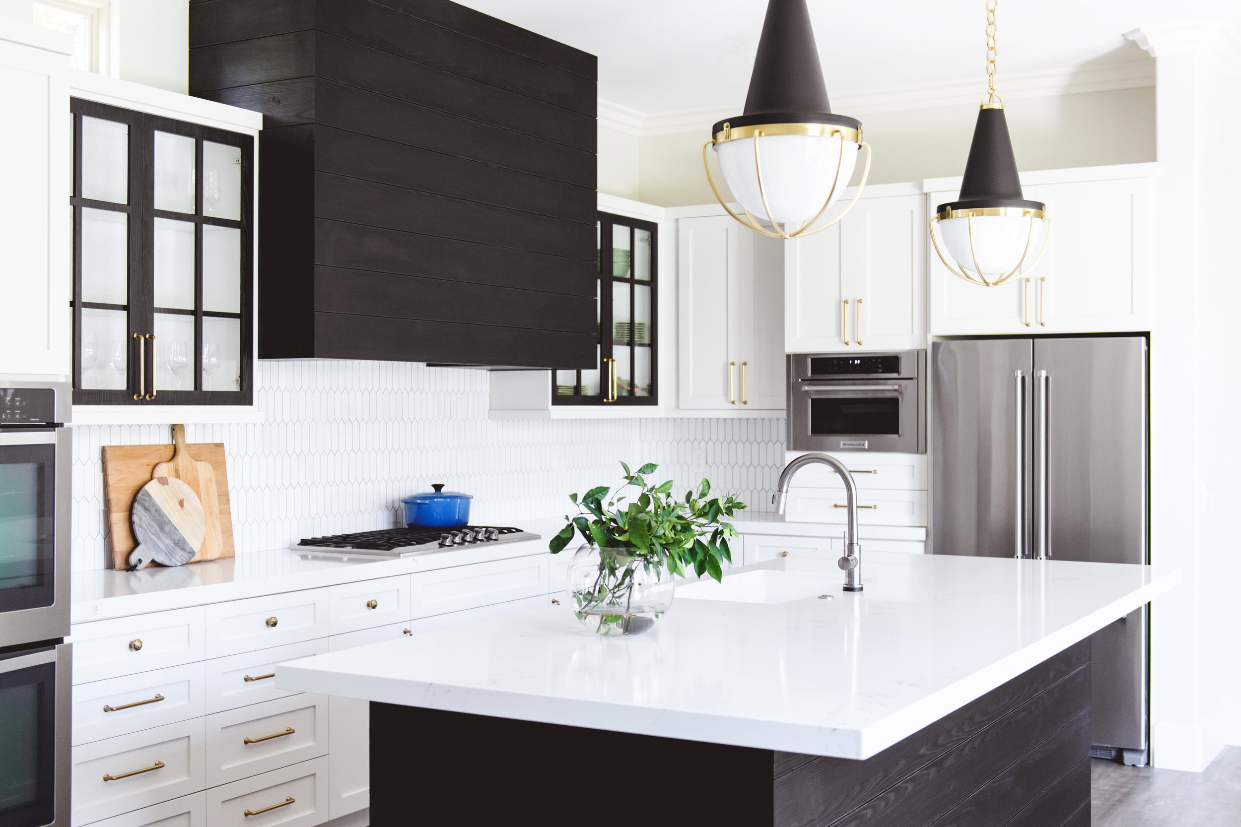
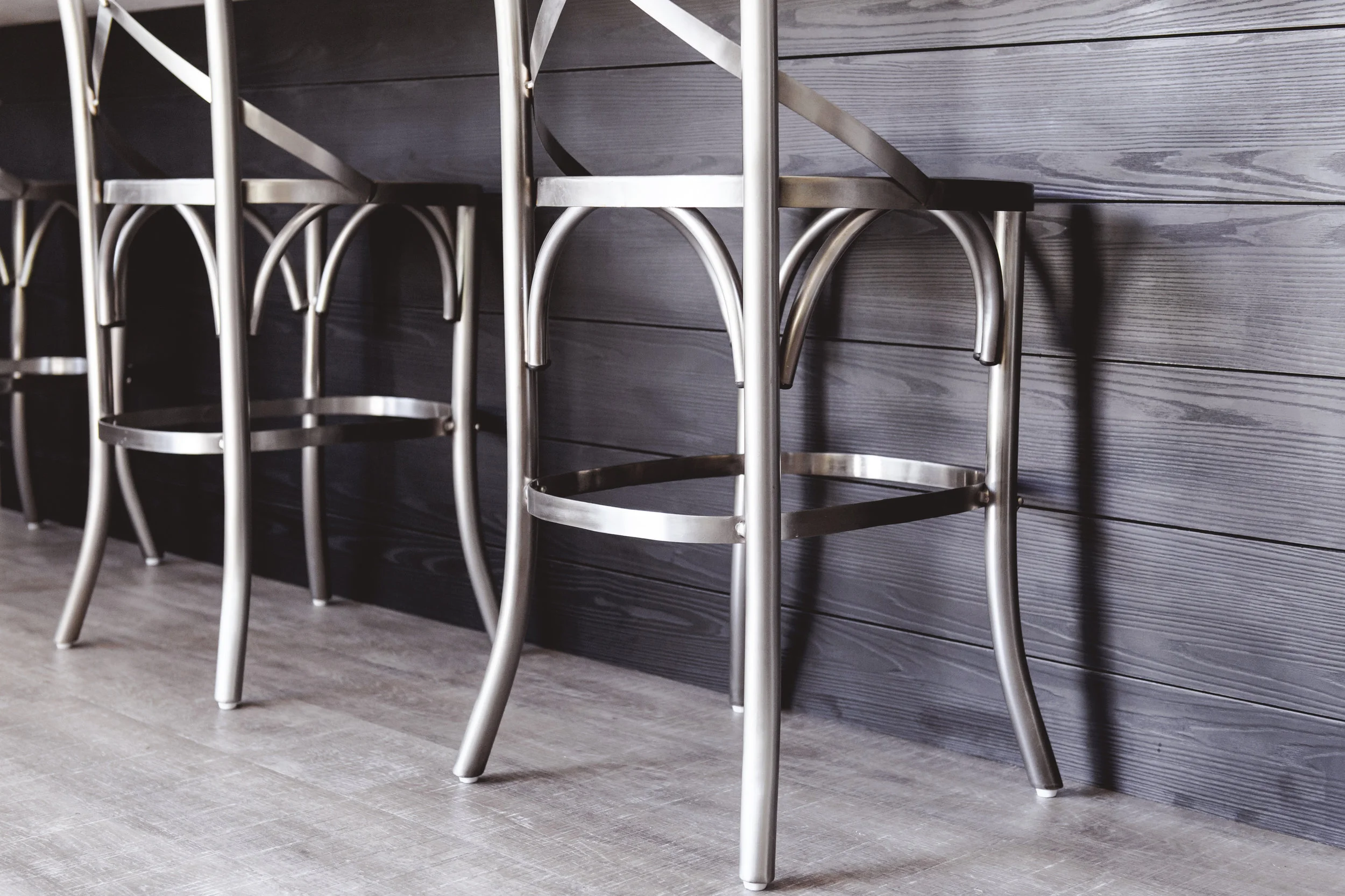
We took a bit of a risk with the cabinetry by using a Black Oak Cleaf. Cleaf is a laminate made to look like stained oak. Since it is a laminate, it can stand the heat, stains, water, and general wear and tear of a kitchen more than solid wood...would. To try to keep it from becoming too formal, we used the Cleaf to create a shiplap-like horizontal planking on the existing hood and the back of the island. To tie in the upper cabinets, so we thinned out the Cleaf to make an inset cabinet with the black trim and seeded glass.
See how we've used Cleaf before:
COUNTERTOPS & TILE
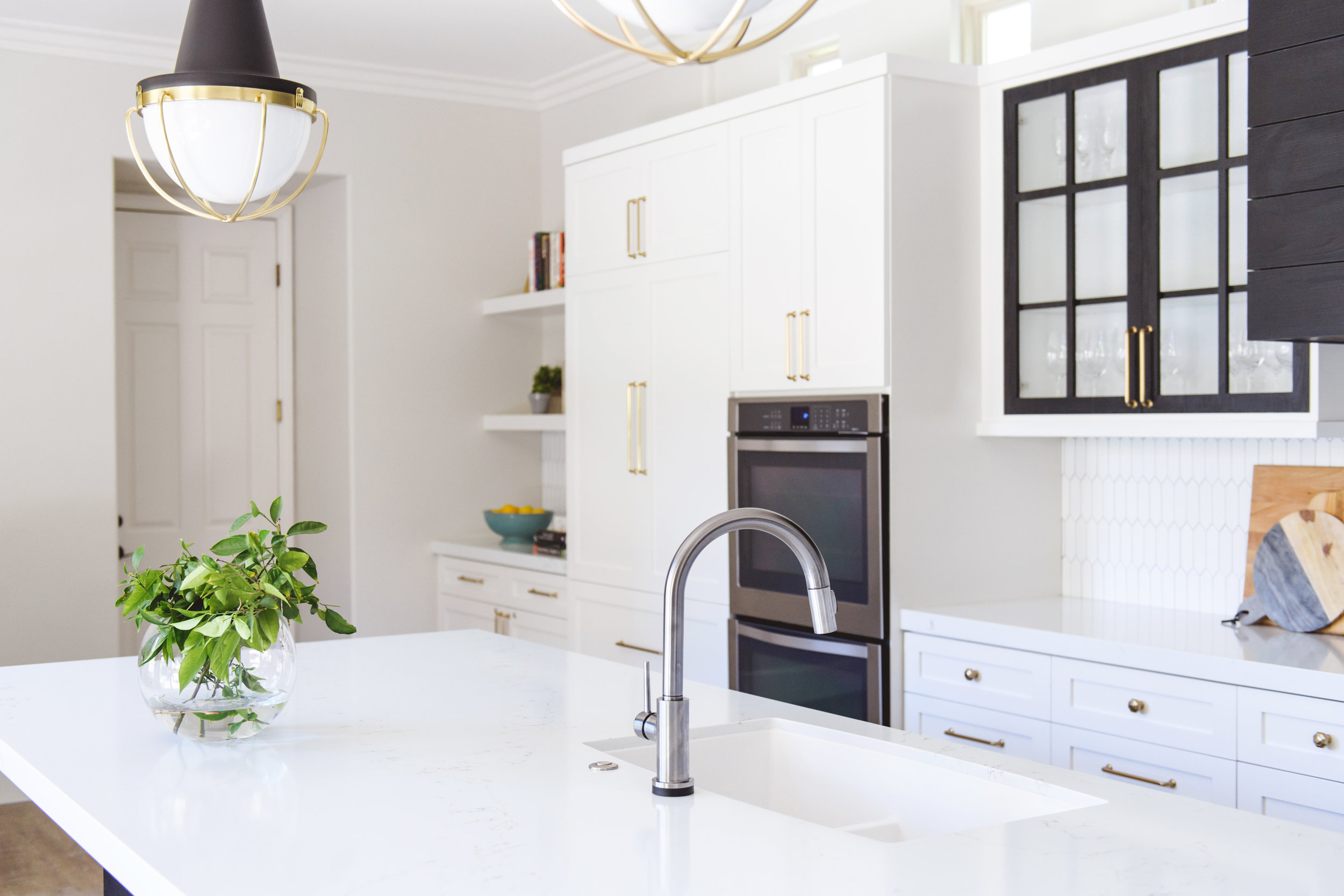
To contrast the darker cabinets, we decided to go with white countertops and a white backsplash. We chose a Pental Quartz called Statuario. We love using Quartz because they are manmade countertops that look like marble. Thanks to its high quality resins, the surface becomes highly scratch-, stain-, chip- and water-resistant. The picket white tile with a pewter grout gives us a little bit of visual interest while still staying monochrome.
LIGHTING & HARDWARE
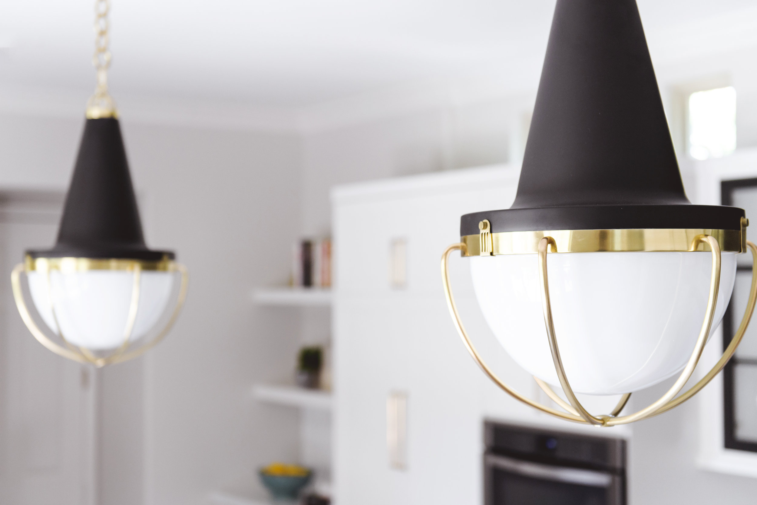
The showstoppers in this space are the oversized Axel pendants by Robert Abbey. We love the industrial meets traditional vibe of these lights and how well they play into our inspiration, the piano. Their interesting shape really brings your eye up.
I've always thought that cabinet hardware is to a kitchen like jewelry is to a really good outfit. We mimicked the brushed gold of the light fixtures and used gold cabinet pulls by Atlas Homewares.


